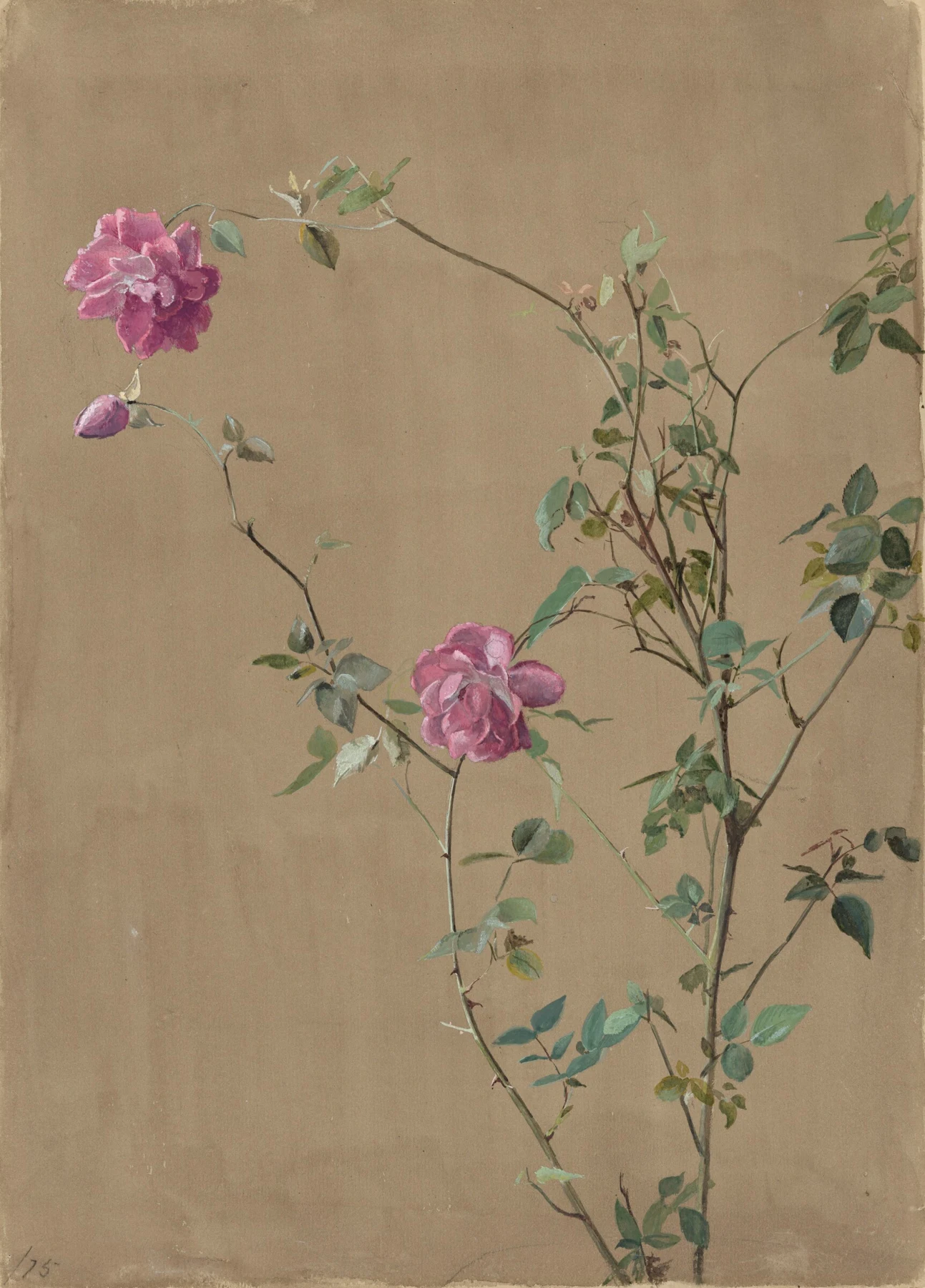
- Follow the long stem from the lower edge towards the upper-left rose. Notice how little of that journey is actually flower.
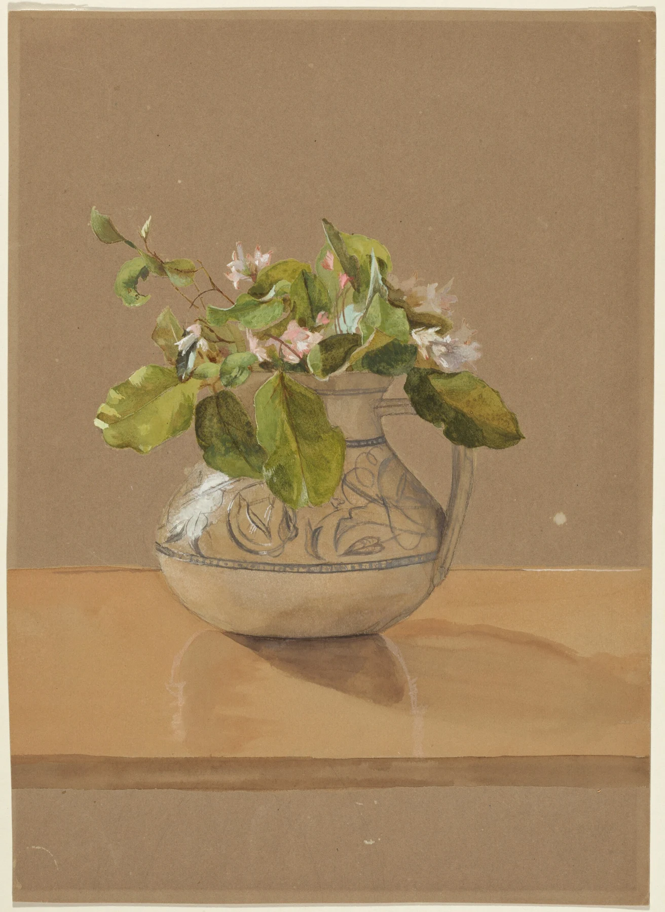
- Compare the open centre of Pink Roses with the overlapping leaves in Flowers in a Pitcher. One spreads; the other gathers.
- Look for the small pale marks against the warm ground. Do not assume that every light in every watercolour is untouched white paper.
These observations describe what is visible, not how the artist made the painting.
A career, not a decorative footnote
Fidelia Bridges (1834–1923) was born in Salem, Massachusetts. After working as a governess, she studied in Philadelphia in 1860, including with William Trost Richards. His Ruskin-influenced attention to nature helped shape her close studies of plants and birds. She exhibited at the Pennsylvania Academy in 1862, travelled in Europe in 1867 and became an associate of the National Academy of Design in 1873. By the 1870s she was moving from oils towards watercolour; she joined the American Society of Painters in Water Colors in 1875.
Her career also reached people through print. Louis Prang bought paintings for calendar illustrations in 1875; between 1881 and 1899 she designed cards, calendars and gift books for his firm. Commercial work helped support her move to Canaan, Connecticut, in 1890. She lived there until her death. These dates and career details follow the New Britain Museum of American Art’s biography.
That combination matters. A painter could exhibit original works and make images for everyday printed objects. Looking only for the grand exhibition picture would miss part of her working life. Equally, calling a flower picture merely decorative tells us very little about the decisions it contains. Decoration is not an automatic exemption from thought. The petal has not signed such an agreement.
Pink Roses: detail needs somewhere to breathe
In Pink Roses, dated 1875, the flowers occupy surprisingly little of the sheet. The larger bloom hangs towards the upper left. A second sits lower and nearer the centre; the thicker stems gather to the right. Much of the warm ground remains open. Follow the bends and gaps before inspecting a petal and the arrangement becomes a set of intervals: a long reach, a pause, a cluster, another reach.
The leaves do not all face us like samples pinned to a board. Some present a broad surface; others narrow to an edge or turn away. Their varying directions give the stem a life beyond its outline. Small thorns and interruptions keep it particular. The result is carefully described without filling every available patch of paper with information.
For a painter, this is an argument for deciding where the attention belongs. More detail everywhere would flatten the difference between the rose, its supporting leaves and the open ground. Ask where your eye rests, and which quieter passage lets it get there. You can borrow that question for a Liverpool street corner as readily as for a plant: a shopfront also needs some space around its best idea.
The jug changes the whole conversation
Flowers in a Pitcher, dated to the 1870s, gathers foliage into a compact mass above a patterned vessel. The broad leaves overlap the neck and body. A horizontal tabletop and a shadow beneath the jug give this arrangement a place to stand. Where Pink Roses lets us travel through a stem, this picture asks us to judge a weight, a cluster and a supporting surface.
Notice the amount of quiet space above the bouquet. The pitcher is not pushed up to fill the sheet. Within the cluster, light and dark leaves make small turns readable; the few pale flowers punctuate a largely green passage. Below them, the blue-grey decoration curves across the vessel. Pattern supplies information about the surface, but it also competes for attention. Compare its strength with the dark recesses between leaves.
The National Gallery of Art records this work as watercolour on brown wove paper. That support is part of the visible colour relationship. It is tempting to treat a warm background as a neutral stage set, yet a pale mark against brown behaves differently from the same mark against white. A paper choice can change the whole painting before the first leaf arrives.
Watercolour has more than one kind of light
The NGA catalogues both pictures as watercolours. Its records do not provide a brush-by-brush account of their making, so the visible pale accents are a reason to look closely, not proof of a particular sequence. Keep that distinction when learning from a reproduction. We can describe the relationship we see without pretending we watched Bridges paint it.
For a documented material comparison, Harvard Art Museums’ film Opacity vs Transparency considers Bridges’ Daisies in a Meadow alongside Sargent’s Grand Canal, Venice. Harvard identifies transparent and opaque watercolour in both works. The comparison helps dismantle the idea that a watercolour must belong to a single pure recipe. An opaque passage can have a different job from a transparent wash within the same sheet.
Try to name the job before choosing a material: preserve a luminous light, cover a darker ground, soften an internal transition, or state a sharp edge. Those are useful intentions. Collecting rules about what real watercolour is allowed to do can occupy an entire afternoon without producing a particularly convincing leaf.
Why this history belongs beside the big landscapes
Bridges brings a professional woman’s sustained attention to modest natural subjects into our reading room. The documented exhibition and publishing work gives us two ways to think about recognition: the original on a wall and the reproduced image in ordinary use. Neither route tells the whole story by itself. Ask what changes when a painting becomes a calendar image: its size, surroundings, audience and the time someone spends looking.
There is also a useful challenge to our habits as viewers. We can mistake small subject matter for small ambition, or delicate description for an absence of structure. In these two paintings, organisation is visible at a distance: an asymmetric stem against open ground, then a gathered bouquet balanced above a vessel. The detail earns its place inside those larger arrangements.
Put the reproduction down for a moment and choose something near you: a sprig in a jar, a wind-battered leaf, a rose that has passed its florist-approved prime. Look for the unequal spacing and the turn that makes it particular. Our exercise is a modern response to the pictures, not a reconstruction of Bridges’ working method. There is plenty to learn without borrowing her signature.
A route through the studio
Start with the linked Pink Roses gallery study for a slower look at spacing. Then use Louise De Masi’s leaf demonstration below to compare edge control in contemporary practice. Return to the classroom’s negative-painting lesson if the gaps between stems keep disappearing. These are complementary ways of working, not claims about Bridges’ technique.
If you are using Mark’s palette, the existing mixing guide provides on-paper tests for greens and neutrals. Pick a small selection you already know and test it on the paper you intend to use. The aim here is a convincing arrangement and a few deliberate edges; nobody is checking whether your paint box has assembled the full orchestra.
Watch, look again, then paint.
A contemporary leaf study to take the close looking into practice. It teaches watercolour handling; it does not reconstruct Bridges’ palette or painting sequence.
Watercolour Leaves Study // Wet on Wet and Other Techniques Demonstrated 🍂
From Louise De Masi · Contemporary watercolour demonstration
A public eucalyptus-leaf study using several watercolour techniques, including wet-in-wet handling. The creator also offers separate paid classes; this is the free YouTube demonstration.
Watch with a question: Compare the boundary of a leaf with the softer changes inside it. Where does the water spread, and where does a shape remain definite?
After watching: Paint the same fallen leaf twice: first on dry paper, then inside a carefully dampened silhouette. Let both dry and label the differences in edge and colour movement.
Open on YouTube ↗YouTube supplies the thumbnails. A player loads when you select a film; starting another removes the previous player. Use the direct link if playback is restricted.
One sprig, two arrangements
- Choose a fallen sprig or a plant you may observe without damaging it. Put it against a plain background with steady light. Use your usual paper and paints.
- Make two small pencil thumbnails. In the first, spread the stem across the sheet; in the second, gather it into a tighter area. Draw the three largest gaps as carefully as the leaves.
- Select the clearer arrangement. On a postcard-sized sheet, mark the main stem and just five important leaf shapes. Leave enough open paper for the arrangement to breathe.
- Paint a light first statement. Let it dry. Add a few darker overlaps and vary the leaves: one broad face, one edge-on shape, one turning away. Do not give every vein equal billing.
- Use a second small study to change one variable: the position of the sprig or the width of the main gap. Keep your palette and time allowance the same.
- Let both dry, step back and compare. Circle the passage that carries the arrangement and note one detail you could remove. Bring both studies and that observation to the discussion.
- Can someone follow the stem without tracing it with a finger? Does the open space have a clear shape? Which change improved the arrangement, and which merely added activity?
Make this a study of your own subject. These are our practice prompts, not a claim to reproduce an artist’s exact method.
Take a practice sheet →- When words grow leaves: William Blake’s painted poems
- Walking into a painting: Kurosawa, Van Gogh and the moving eye
- A wave on the score: Hokusai, Debussy and painting with rhythm
Keep looking
- New Britain Museum of American Art: Bridges’ life, training, exhibitions and Prang work
- National Gallery of Art: Pink Roses, 1875
- National Gallery of Art: Flowers in a Pitcher, 1870s
- Harvard Art Museums: Opacity vs Transparency — Bridges and Sargent
- Look longer: Pink Roses in the international gallery
- Classroom: flowers and still life
- Practical guide: paint around the light
- Mark’s twelve-pigment mixing guide
Sources support the factual context; looking notes and exercises are Watercolourist editorial interpretation.
What happened on your paper?
A study, a discovery, or a wash with a mind of its own. Share your painting, ask a question or show what happened when you tried an exercise. Tell us if you would like critique.
Sign in or join to post under your username. Your contribution appears in the studio discussion with a link back here. See what other painters are discussing →