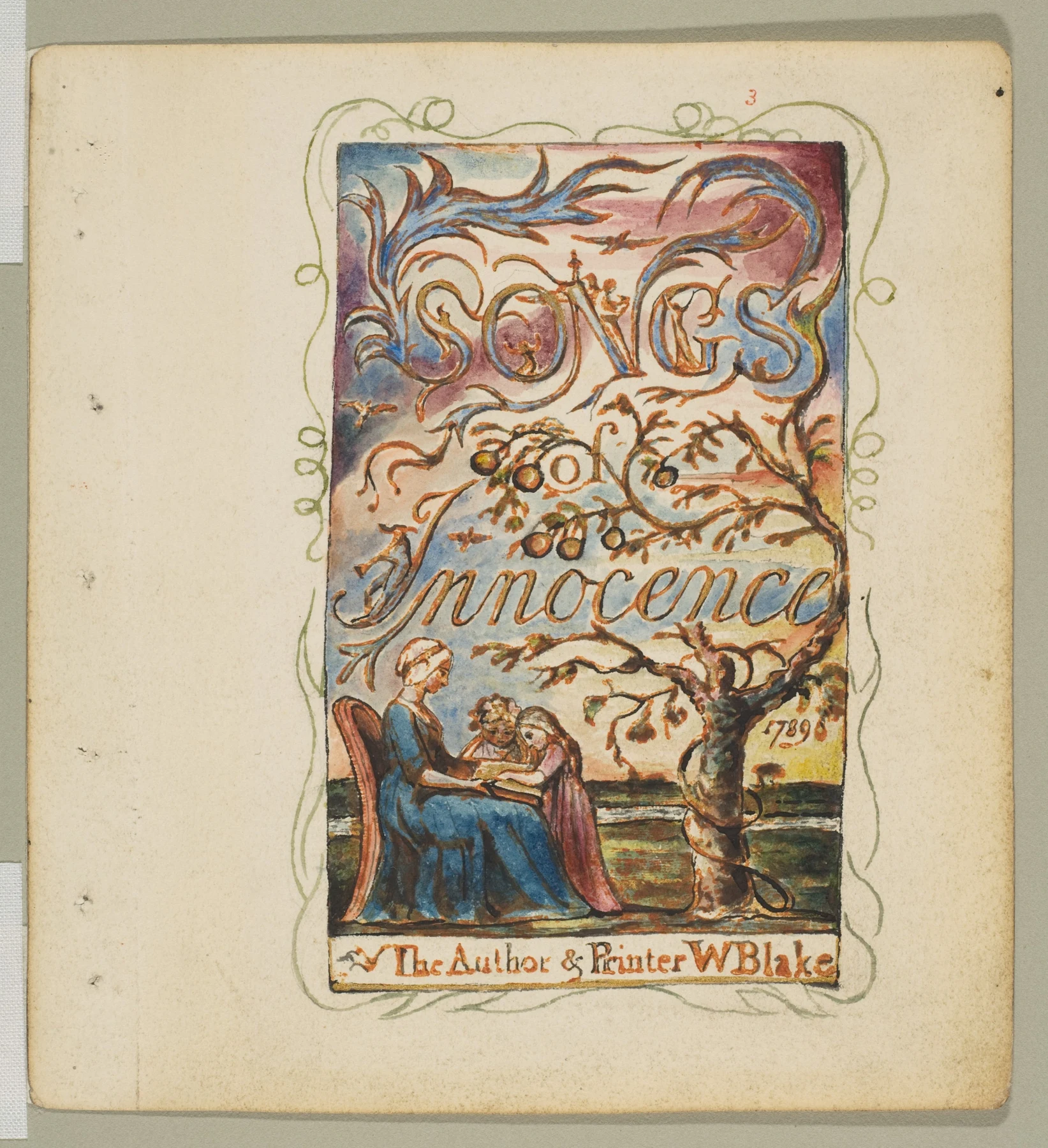
- In the title page, sweeping blue forms and the large curling letters dominate the upper area; the reading group and tree anchor the bottom.
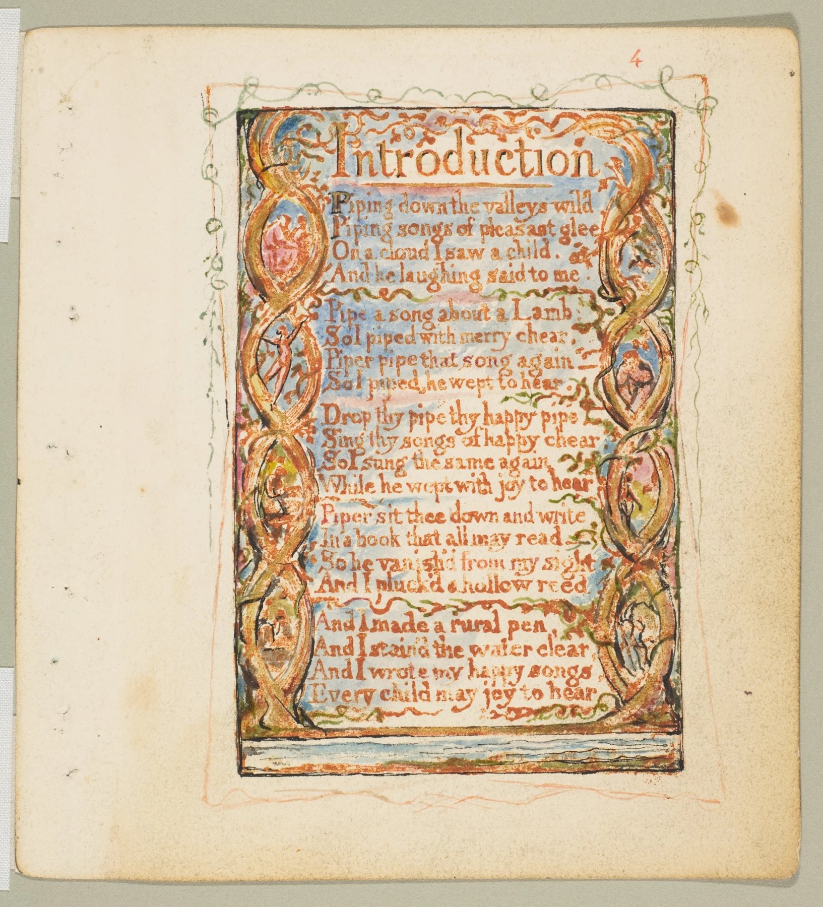
- In Introduction, repeated oval border shapes flank the central text, while thin green curves separate several groups of lines.
These observations describe what is visible, not how the artist made the painting.
A book you look at as well as read
William Blake’s Songs of Innocence refuses the tidy arrangement in which the words do their job upstairs and the picture politely waits below. Letters stretch into vegetation; figures gather among the curves. Before you have read a complete sentence, the page has already established a pace. This is particularly useful company for a watercolourist whose sketchbook alternates between beautiful washes and captions that look as though they were added at a bus stop.
The two sheets shown here belong to the Metropolitan Museum’s copy Y. Their dates need a little care: the designs originate in 1789, but these impressions were printed around 1825. The museum identifies their medium as relief etching in orange-brown ink, hand-coloured with watercolour and shell gold. They are printed and painted objects, not simply watercolours illustrating a separately typeset text. The Met records that Blake continued making individually coloured copies over several decades.
Read the shapes before the words
On the title page, the largest lettering fills almost the entire upper half. Its swelling curves have visual relatives in the branches and the long blue forms overhead. Below, the seated adult and children form a compact group beside a tree. Try covering the letters with your hand, then covering the figures. The page loses something different each time: first its sweeping upper movement, then its little gathering of attention at the foot.
That is an observation about this particular impression, rather than a claim that every curve has a fixed symbolic translation. Resist turning a rich page into a detective puzzle with one approved answer. Look instead at the changing intervals: large letters, smaller connecting words, open patches, crowded foliage. A quiet patch beside a busy shape makes the busy shape easier to see. Your own sketchbook border can do this without acquiring a full supporting cast of tiny angels.
The poem also has a visible tempo
Now move to Introduction. The poem occupies a central column, bordered by repeated curling forms containing small figures. Green and warm-coloured dividers mark pauses between groups of lines. The orange-brown lettering sits against pale blue passages, so text and surrounding colour share the same page rather than appearing in separate compartments. Follow a single border from top to bottom and then read the poem; notice how your attention changes direction.
The poem itself moves between piping, singing and writing. That makes the decorated written page especially worth considering: the reader encounters a visible object that describes changes of medium. This is a close-reading invitation, not evidence that Blake devised a modern lesson about multimedia. To explore further, open the Met’s enlarged Introduction, read the entire short poem, then return to the title page. Notice whether the illustrated act of reading feels different after that sequence.
Borrow the relationship, keep your own voice
For a studio experiment, choose a few words you have written about an ordinary subject: the allotment after rain, a chipped jug, a tree outside the window. Decide which words need room, which can sit quietly, and where a painted shape might interrupt the reading. Make the lettering part of the composition from the beginning. Beautiful handwriting is optional; deliberate spacing is considerably more useful.
Keep the palette small and test any pen with a wet brush on scrap paper before committing. Leave some lettering on unpainted paper and let another passage sit over a completely dry pale wash. These are contemporary sketchbook suggestions, not a reconstruction of Blake’s printing process. When finished, check two things separately: can someone read it, and does the whole page hold together when viewed from across the table? A page can pass one test while gleefully failing the other.
One sentence, one painted page
- Write a sentence of 12–20 original words about something you can see. Underline two words that carry its mood.
- Draw three small page plans. Change the size and placement of those two words; reserve an open area in each design.
- Choose one plan and use two watercolours plus a tested waterproof pen or a small brush. Let washes dry before adding any text that must stay crisp.
- Read the finished page aloud, then view it at arm’s length. Record one place where the image helps the words and one place where it distracts.
Make this a study of your own subject. These are our practice prompts, not a claim to reproduce an artist’s exact method.
Take a practice sheet →Keep looking
- The Met: Songs of Innocence, Title Page — copy Y, date, materials and history
- The Met: Songs of Innocence, Introduction — enlarge and read the complete plate
- The Met: William Blake exhibition — illuminated books and his working methods
Sources support the factual context; looking notes and exercises are Watercolourist editorial interpretation.
What happened on your paper?
One useful observation beats “lovely work”. Show a study, ask about a decision, or tell us where you disagree.
Join the studio discussion