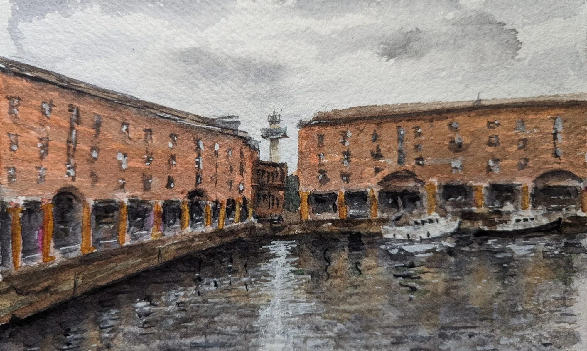
Make the chart earn its place
A useful mixing chart is a map back to a colour you might actually need. It should help with that rain bank over the Mersey, a warehouse wall or a tree that has gone alarmingly lime. This guide starts with the twelve pigments already in Mark’s box. No extra tube has been appointed head of atmospheric effects.
Work on Baohong rough 300 gsm, Mark’s usual paper, if you have it; otherwise use the paper you normally paint on and write its name on the sheet. Take one of the Escoda travel rounds for the washes, the Rosemary & Co flat for a broad shape and the rigger for the very last accents. You can do every exercise with one serviceable round. The point is to understand the mixtures, not complete a tool inventory.
The twelve on the table
Ten Daniel Smith colours and two ROSA Gallery colours. These are the current core paints; the auxiliary colours stay in their own box.
- PY42Raw Sienna LightDaniel Smith
- PBr25Permanent BrownDaniel Smith
- PB60Indanthrone BlueDaniel Smith
- PBk31Perylene GreenDaniel Smith
- PY139Isoindoline YellowDaniel Smith
- PR255Pyrrol ScarletDaniel Smith
- PB29French UltramarineDaniel Smith
- PG7Emerald Green / Phthalo Green BSROSA Gallery
- PY151Azo YellowROSA Gallery
- PV19Quinacridone RoseDaniel Smith
- PB15:3Phthalo Blue GSDaniel Smith
- PY129Rich Green GoldDaniel Smith
All colour patches on this page are digital illustrations of colour families and strength, not measured mixtures or scans of Mark’s paint. Use the recipes as starting points and make the final chart on your own paper.
Two controls: pigment balance and water
First change the balance between colours: blue-led, a quieter middle, then brown-led, for example. Make each in a separate well with a clean brush. Next choose one balance and divide it into three puddles. Keep one stronger, dilute the next, then dilute the third further. Paint all three. That separates a change in hue from a change in strength; otherwise every sample changes two things and tells you very little.
Brushful ratios are only starting records. A loaded small round, a barely damp large round, fresh tube paint and a dry pan do not deliver equal amounts. Begin with the less overpowering colour and bring the stronger one in gradually. Note your own recipe in words or brush-load counts once it works. Never treat a screen patch as a target you must match at any cost.
Let the samples dry completely. Observe value, hue, texture and the edge separately. French Ultramarine PB29 is the granulating blue in this set; Daniel Smith lists Indanthrone PB60 as non-granulating. Rough paper gives texture a chance to show, but water, application and the specific paint still matter. Label each test with the pigment codes so the discovery survives the next palette rearrangement.
Four subjects, sixteen useful starts
Choose the subject giving you trouble today. Each chart offers four possible mixtures, then a small painting challenge. The patches suggest colour families at three strengths; your dried swatches are the reference that matters. Keep every useful result, including the mixture that did not do what you expected.
A sky with weather in it
Start by deciding where the light is. A Liverpool sky can contain blue openings, warm low cloud and a cool rain bank within the same view. One uniformly grey lid loses those relationships. Look for the largest light shape, then choose a blue that suits the job: French Ultramarine for a wash that can show granulation, Indanthrone for a deeper blue passage, or a very small amount of Phthalo Blue for a clearer opening.
The first two mixtures below explore blue against reddish brown. Permanent Brown here is PBr25, not a Burnt Sienna formula borrowed from another palette. Start with the blue, introduce brown gradually and stop at a useful grey before the puddle turns into a debate. A little remaining colour is often more convincing than a perfectly neutral sample. Make the pale version with clean water, not another pigment.
Broken-cloud grey
French Ultramarine PB29 + Permanent Brown PBr25
PaleMiddleDeepMake a puddle of French Ultramarine. Add Permanent Brown in small touches until the blue is subdued but still visible. Split it into three wells and dilute two. Use the palest for an overall cloud shadow; save the deeper mix for one passing bank.
Rain over the Mersey
Indanthrone Blue PB60 + Permanent Brown PBr25
PaleMiddleDeepBegin with Indanthrone Blue and nudge it towards grey with Permanent Brown. Keep it blue-led. Test a strong patch before touching the sky: a dark puddle is easy to make and considerably less easy to remove from the weather.
A mauve turn in the cloud
French Ultramarine PB29 + Quinacridone Rose PV19
PaleMiddleDeepTouch Quinacridone Rose into French Ultramarine for a violet family. Dilute generously and use sparingly beside a cooler grey. The mix is a colour option, not an instruction that every cloud must wear mauve.
The blue opening
Phthalo Blue GS PB15:3 + Permanent Brown PBr25
PaleMiddleDeepStart with a tiny touch of Phthalo Blue in plenty of water. Add only enough Permanent Brown to quiet the brightness. Compare it with pure diluted blue on a scrap; use whichever fits the observed sky. Leave the lightest opening as paper.
Digital colour guide. Paint the three strengths on Baohong rough 300 gsm, or your usual paper, and judge them completely dry.
Three skies, one strip of Liverpool
- Divide a scrap into three postcard-width rectangles. Use the same very simple waterfront silhouette in each, with the horizon low. Mark the main light shape in pencil, lightly enough that it will not become scaffolding.
- First sky: work on evenly damp paper with broken-cloud grey, leaving a light gap. Second: use the rain mixture and deepen only one bank while the surface still has an even sheen. Third: keep a small blue opening and a faint mauve cloud edge. Do not add all four recipes to every sky.
- Let each sky dry fully before adding the same dark silhouette. Keep that skyline simple so you are comparing weather, not counting windows. Label the blue, the brown and the surface wetness beside each study.
Look for: Can you see a clear light shape in all three? Does the sky still read before the buildings are added? Choose the most convincing edge, not the smoothest wash.
If it goes sideways: If the wash develops a hard cauliflower edge, record where a wetter brush entered a drying wash. Repeat a smaller patch with less water in the brush. If everything is heavy, begin the next sky paler; scrubbing is unlikely to improve the forecast.
A wall, before it becomes a thousand bricks
Brick is an arrangement of light, colour and repeated marks. It is rarely improved by giving every brick an outline and a small personal biography. Choose a whole wall shape first. The warm families below can suggest pale masonry, red brick, a warmer accent and weathered recesses; observation decides which belongs in your scene.
Use the side of a travel flat or a round with a good belly for the first wash. On rough paper, a drier brush can catch the high points and leave broken texture. That is useful only after the broad light and shadow are established. Keep mortar as occasional pale interruptions or a few carefully placed marks, rather than a grid laid over the entire building.
Pale warm masonry
Raw Sienna Light PY42 + Pyrrol Scarlet PR255
PaleMiddleDeepStart with Raw Sienna Light. Add a small touch of Pyrrol Scarlet to steer it towards a gentle orange earth. Make a light first wash and judge the dry result before adding more red; pale masonry is easily promoted to tomato soup.
Red brick body
Pyrrol Scarlet PR255 + Permanent Brown PBr25
PaleMiddleDeepStart with Pyrrol Scarlet and introduce Permanent Brown to reduce the brightness. Keep a neighbouring well a little redder, another browner. Drop small variations into a wet wall rather than repainting every rectangle separately.
A warm sunlit accent
Isoindoline Yellow PY139 + Pyrrol Scarlet PR255
PaleMiddleDeepBegin with Isoindoline Yellow and add Scarlet a little at a time. This can be a lively orange family: use it in a small warm passage or dilute it for a glow. If it is too bright for the actual wall, quiet a separate sample with a trace of the blue used elsewhere in the picture.
Weathered brown
Permanent Brown PBr25 + French Ultramarine PB29
PaleMiddleDeepReverse the emphasis of the sky mixture: begin with Permanent Brown and add French Ultramarine. Stop while it remains a brown family. Use it for restrained texture or a shaded return, keeping the deepest accents smaller than the wall.
Digital colour guide. Paint the three strengths on Baohong rough 300 gsm, or your usual paper, and judge them completely dry.
One warehouse, three decisions
- Choose a Liverpool warehouse from your own reference. Draw only the outer shape, roof and one change of plane. Make three small rectangles beside it: the light wall, shaded wall and darkest opening. Mix those before starting.
- Paint the wall in one light wash, varying the red-brick mixture while it is still wet. Preserve a few small paper lights. Leave it alone until fully dry, then place the shaded return as one joined shape.
- Use the flat edge for two or three window groups. Add just six brick or mortar indications near the focal area. Leave the rest to the viewer; they have seen a wall before. Finish with one darker accent, then step back.
Look for: Does the building read as two planes when you half-close your eyes? Are the marks supporting the wall, or are they the only thing you can see?
If it goes sideways: If the brick marks take over, stop adding them. Repeat the same subject in half the size with a larger brush. If the colour looks flat, vary the wash next time rather than applying a different red to every brick.
Dark does not have to mean dead
Separate colour from value. A rich violet that dries too pale will not explain a deep doorway; a dark enough grey can. Also separate the object from the light falling across it. A shadow crossing pavement and brick need not become two unrelated stripes. Keep a family resemblance while allowing the underlying surfaces to show through.
There is no universal blue shadow. Look at the light, reflected surroundings and local colour. These mixtures are options for testing: violet, muted violet, green-to-plum neutral and deep green-blue. Paint a small strip over a fully dry base wash before putting any of them on the main study. A good-looking puddle is not yet an audition on the paper.
Deep violet family
Indanthrone Blue PB60 + Quinacridone Rose PV19
PaleMiddleDeepAdd Quinacridone Rose to Indanthrone Blue, keeping the blue dominant for a cool dark. Increase the rose in a separate well for comparison. Use fewer brushfuls of water for the deep sample; more pigments are not required to make it stronger.
A quieter pavement violet
French Ultramarine PB29 + Quinacridone Rose PV19 + Permanent Brown PBr25
PaleMiddleDeepMix Ultramarine and Rose first, then touch in Permanent Brown to quiet the violet. This is deliberately a three-pigment test. Stop once the relationship works; repeated adjustment in the same well can erase the colour you liked.
Green meets rose
Emerald Green / Phthalo Green BS PG7 + Quinacridone Rose PV19
PaleMiddleDeepBegin with Quinacridone Rose and introduce tiny touches of ROSA PG7. Make three balance tests separately: rose-led, near neutral and green-led. The strip here suggests the green-led route; your near-neutral result may lean violet, brown or green. Keep the useful one, not a promise of perfect black.
Under the trees
Perylene Green PBk31 + Indanthrone Blue PB60
PaleMiddleDeepStart with Perylene Green and add a small amount of Indanthrone. Test both a diluted patch and a concentrated one. Reserve this dark family for connected recesses or foliage shadows, leaving some lighter passages so the dark has somewhere to belong.
Digital colour guide. Paint the three strengths on Baohong rough 300 gsm, or your usual paper, and judge them completely dry.
A shadow that joins the street
- Paint a tiny warm wall and a pale pavement strip. Let both dry fully. Beside them, test two shadow mixtures across offcuts of the same base washes. Choose by value and relationship, rather than which puddle looks most dramatic.
- Draw one cast-shadow shape that crosses wall and pavement. Paint it as a connected wash, turning the direction at the corner to explain the change of plane. Keep one crisp boundary and soften a short section while it is still workable.
- Leave the study to dry before adding a small doorway dark. Compare the doorway, shadow and lit surface. You want three distinct jobs, not three versions of the darkest mixture you can produce.
Look for: Does the shadow connect the scene while the doorway still reads darker? Can you tell which surface receives the light without relying on outlines?
If it goes sideways: If a glaze lifts the base colour, use a softer single pass on a fully dry test next time. If the shadow is too colourful, neutralise a fresh sample in tiny increments. Do not try to repair the whole street while it is half dry.
Several greens. One believable tree.
A tree does not need a different tube for every leaf. It does need a light side, a middle and an interior, plus a little variation in temperature. Begin with one yellow-led mixture and one darker relative. Let the lightest passages contain more water and more paper; do not demand that the brightest yellow-green also provide the deepest shade.
PG7 and PB15:3 can dominate a mixture quickly, so introduce them in small touches. Rich Green Gold PY129 is a separate single pigment here, not a shortcut name for Quinacridone Gold. ROSA Azo Yellow PY151 is listed as semi-opaque by its maker: test what happens over a dry dark line rather than assuming all yellow mixtures have equal transparency. A small dried swatch will settle the matter more usefully than an argument with the label.
Fresh leaf green
Azo Yellow PY151 + Phthalo Blue GS PB15:3
PaleMiddleDeepBegin with Azo Yellow and add the smallest touch of Phthalo Blue. Keep the first mix yellow-led. Make a separate bluer version for comparison. If it becomes startlingly bright, try a trace of Permanent Brown in a spare well rather than dulling the whole supply.
A warmer middle green
Isoindoline Yellow PY139 + Emerald Green / Phthalo Green BS PG7
PaleMiddleDeepMake a puddle of Isoindoline Yellow, then add ROSA PG7 in tiny increments. Stop at a yellow-green or olive family that suits the subject. Change the pigment balance on a second strip; changing water alone will only change its strength.
Gold into forest shade
Rich Green Gold PY129 + Perylene Green PBk31
PaleMiddleDeepStart with Rich Green Gold and add Perylene Green for a deeper, quieter family. Keep a little unmixed Green Gold nearby for a warmer light passage. Compare this mixture with the bright leaf green; they need not compete for the same part of the tree.
A subdued distant green
Raw Sienna Light PY42 + French Ultramarine PB29
PaleMiddleDeepStart with Raw Sienna Light and add French Ultramarine. Expect a quieter range than the Azo–Phthalo combination, with the outcome shifting as blue takes over. Dilute for a distant bank and test for visible granulation when dry. Do not force it to impersonate a luminous spring leaf.
Digital colour guide. Paint the three strengths on Baohong rough 300 gsm, or your usual paper, and judge them completely dry.
Sefton Park in three joined shapes
- Choose one tree or a small group from your own observation. Make six tiny swatches: a yellow-led green, its cooler relative and a dark, each at two strengths. Let them dry before choosing three for the study.
- Paint a light canopy shape, leaving a few irregular paper gaps. While the wash is damp, introduce the middle green into a connected area. Let the light shape remain larger than the little dark marks you are itching to add.
- Once dry, place a few linked interior darks and one trunk suggestion. Use a drier flat or the side of a round for broken foliage at one edge. Compare the tree with the pale background, not with an isolated colour chip.
Look for: Can you read the light, middle and interior from across the room? Does one green dominate while the others support it? A convincing tree usually needs a hierarchy more than a collection.
If it goes sideways: If it looks fluorescent, test a tiny complementary red or brown addition in a separate sample. If it looks lifeless, reserve a cleaner light passage in the next study and stop mixing earlier. Adding more yellow to an overworked wet patch rarely brings back the paper.
Keep a small mixing notebook
Put a date beside each row and note the paper, paints and mixture balance. Add a short observation once dry: “too blue for the cloud”, “good warm wall”, “dark enough under the tree”. These notes give a colour a job. A row of unlabeled beautiful swatches gives it a holiday.
Repeat a promising mixture as a wet blend and as a glaze over a completely dry wash. They are different procedures, even with the same pigments. Keep the trials beside one another and decide which gives you the edge, colour and texture you wanted. If a result changes next week, check the amount of water and the paper surface before blaming the manufacturer.
Finish by painting something small with only three or four of the twelve colours. You do not owe every well a starring role in every picture. Use a pale sky, a warm building, a connected shadow and a quiet green, then stop while the relationships still speak to each other.
Watch a decision. Then try it.
Three companion lessons from the classroom. The teachers use their own palettes; use the questions here to test yours.
Color Mixing Lesson and Painting with ONLY THREE PAINTS!
With Jenna Rainey
Look for: How a colour changes when its neighbour or mixture changes.
How to Paint More Interesting Green with Watercolor
Look for: Differences in warmth, strength and value inside an area you would usually call simply “green”.
PAINT AMAZING SKIES IN WATERCOLOUR!
With Oliver Pyle - Our Landscape
Look for: The large arrangement of light and colour before the smaller cloud shapes.
Thumbnails come from YouTube; a player loads only when you choose a lesson. Starting another stops the previous player. Creator links remain available if embedded playback is restricted.
One street, one deliberate palette
- Choose your own Liverpool street reference with sky, brickwork, a cast shadow and some greenery. Draw a postcard-sized outline and a separate three-value thumbnail. Add drying time to the session rather than rushing between layers.
- Select four or five pigments from the guide. Make a sky mix, wall mix, shadow and green on a scrap; at least two mixtures should share a pigment. Check that the shadow dries darker than the wall and that the sky stays lighter than the main building.
- Paint the large light shapes first, let them dry and connect the shadow. Add only the details needed to recognise the place. Keep the swatches with the painting.
- Next day, paint the same view changing just one mixture. Write one sentence about the improvement or the trade-off. Bring both studies to the discussion, including the one that went a bit peculiar.
Make this a study of your own subject. These are our practice prompts, not a claim to reproduce an artist’s exact method.
Take a practice sheet →Keep looking
- Mark’s current twelve-colour palette and the job of each well
- Daniel Smith: pigment codes, granulation, staining and transparency
- ROSA Gallery: manufacturer colour chart
- ROSA: Azo Yellow PY151 and its stated opacity
- Jane Blundell: green pigments and mixing families
- Print the four blank mixing study sheets
Sources support the factual context; looking notes and exercises are Watercolourist editorial interpretation.
What happened on your paper?
One useful observation beats “lovely work”. Show a study, ask about a decision, or tell us where you disagree.
Join the studio discussion