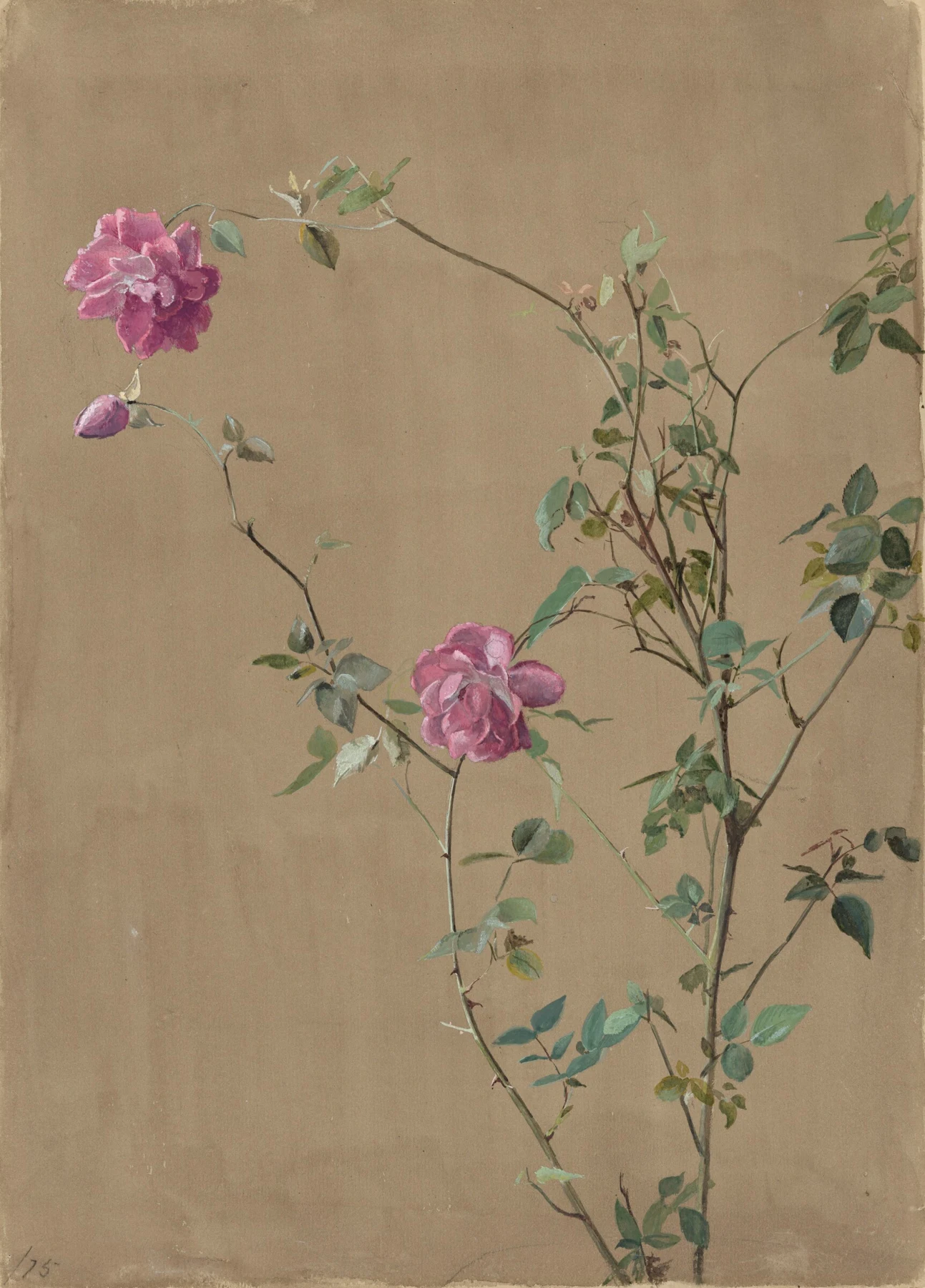
- Find the largest open shape between the upper rose and the stems on the right. Its size is a decision worth noticing.
- Compare the two main flowers: they share colour but do not occupy equivalent positions.
- Follow the small leaves that turn edge-on. Their narrow shapes interrupt any mechanical repetition.
These observations describe what is visible, not how the artist made the painting.
What is on the sheet?
Pink Roses is a vertical watercolour by Fidelia Bridges, dated 1875. The National Gallery of Art identifies its support as wove paper. Two full pink blooms and a bud sit among an uneven network of stems, leaves and thorns against a warm, largely unoccupied ground. The whole composition is reproduced here; open it larger and let your eye travel from the bottom edge to the upper-left flower.
The principal stem rises on the right, but the strongest pink reaches left. That imbalance keeps the arrangement from becoming a central flower with symmetrical accessories. Thin branches connect widely spaced events. You can recognise a rose without counting its petals, while the small variations in the leaves make this particular plant worth attending to.
Why give this quiet picture a wall?
The accompanying artist history places Bridges’ flower and bird studies within a career of exhibition and publishing. Here, concentrate on the object itself. It rewards a kind of looking that can be lost when a painting becomes a small thumbnail: the empty intervals are as important as the recognisable flowers.
The brightest pink is not spread evenly across the sheet. It forms a few concentrated destinations. Greens shift in strength and hue, and the stems have enough darkness to connect the arrangement without turning into a thick outline around everything. Detailed observation and selective emphasis can work together. Painting carefully does not require making every square inch equally busy.
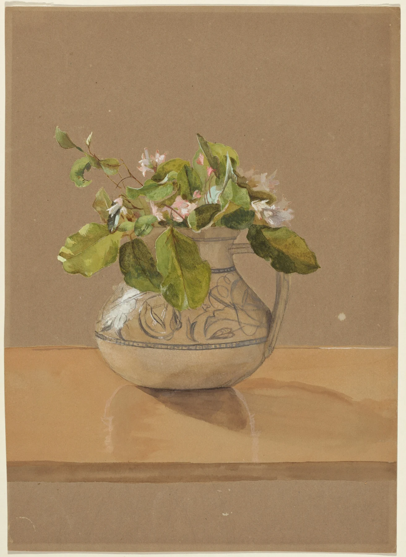
Compare the pitcher: spread out, gather in
In Flowers in a Pitcher, the second painting here, the leaves gather over a vessel rather than extending through most of the height. The tabletop gives us a firm horizontal; the jug and its shadow provide weight. In Pink Roses, stems carry the movement. In the pitcher, overlapping broad leaves carry much of the mass.
Cover one image, then the other. Describe each arrangement in three words before looking at a single small detail. For instance, you might choose reaching, uneven, open for the roses, and gathered, weighted, layered for the pitcher. These are prompts for your own reading, not titles Bridges gave her compositional intentions.
The NGA specifies brown wove paper for Flowers in a Pitcher. Keep that material distinction in mind when comparing the light accents. A reproduction lets us examine their effect; it does not by itself establish the exact pigments, tools or order of painting.
The practical question: what do you leave alone?
Many studies become crowded because a quiet patch starts to feel unfinished. Before adding another leaf, compare the big gap in Pink Roses with the compact foliage above the jug. Open space can be a positive part of an arrangement. Filling it may remove the very relationship that made the subject appealing.
For the challenge below, use a plant you can see rather than copying these roses. The exercise asks you to plan absence: where the paper will remain calm and where you will spend your attention. A leaf with one awkward bend is usually better company than six identical decorative commas.
When reviewing the result, distinguish a useful correction from an extra description. Moving an important gap may improve the whole arrangement. Adding eleven more veins may simply produce a very well-administered leaf. Share the version with the clearer structure and explain which piece of open space you protected.
Paint the gaps before the leaves
- Place one leafy sprig against a plain light surface. Draw three palm-sized rectangles in your sketchbook.
- In each rectangle, place the sprig differently. Lightly draw only the three largest gaps between stems and leaves, leaving the plant itself implied.
- Choose the version with the most distinct large and small spaces. Transfer its main stem and leaf silhouettes to watercolour paper.
- Use a light green wash for the main shapes. When dry, add no more than five dark accents to explain overlaps. Keep the largest planned gap untouched.
- Photograph or view the study at thumbnail size. Compare it with your original plan. If the gap has narrowed or disappeared, make a fresh five-minute study that restores it.
- Are the spaces different in size and character? Can the arrangement survive without the fine detail? Name the gap that does the most work.
Make this a study of your own subject. These are our practice prompts, not a claim to reproduce an artist’s exact method.
Take a practice sheet →Keep looking
- National Gallery of Art: Pink Roses — object, medium, date and rights
- National Gallery of Art: Flowers in a Pitcher — brown paper and full composition
- Artist history: Fidelia Bridges, a small world taken seriously
- Watch and practise: leaf study in the classroom
- National Gallery of Art open-access policy
Sources support the factual context; looking notes and exercises are Watercolourist editorial interpretation.
What happened on your paper?
A study, a discovery, or a wash with a mind of its own. Share your painting, ask a question or show what happened when you tried an exercise. Tell us if you would like critique.
Sign in or join to post under your username. Your contribution appears in the studio discussion with a link back here. See what other painters are discussing →