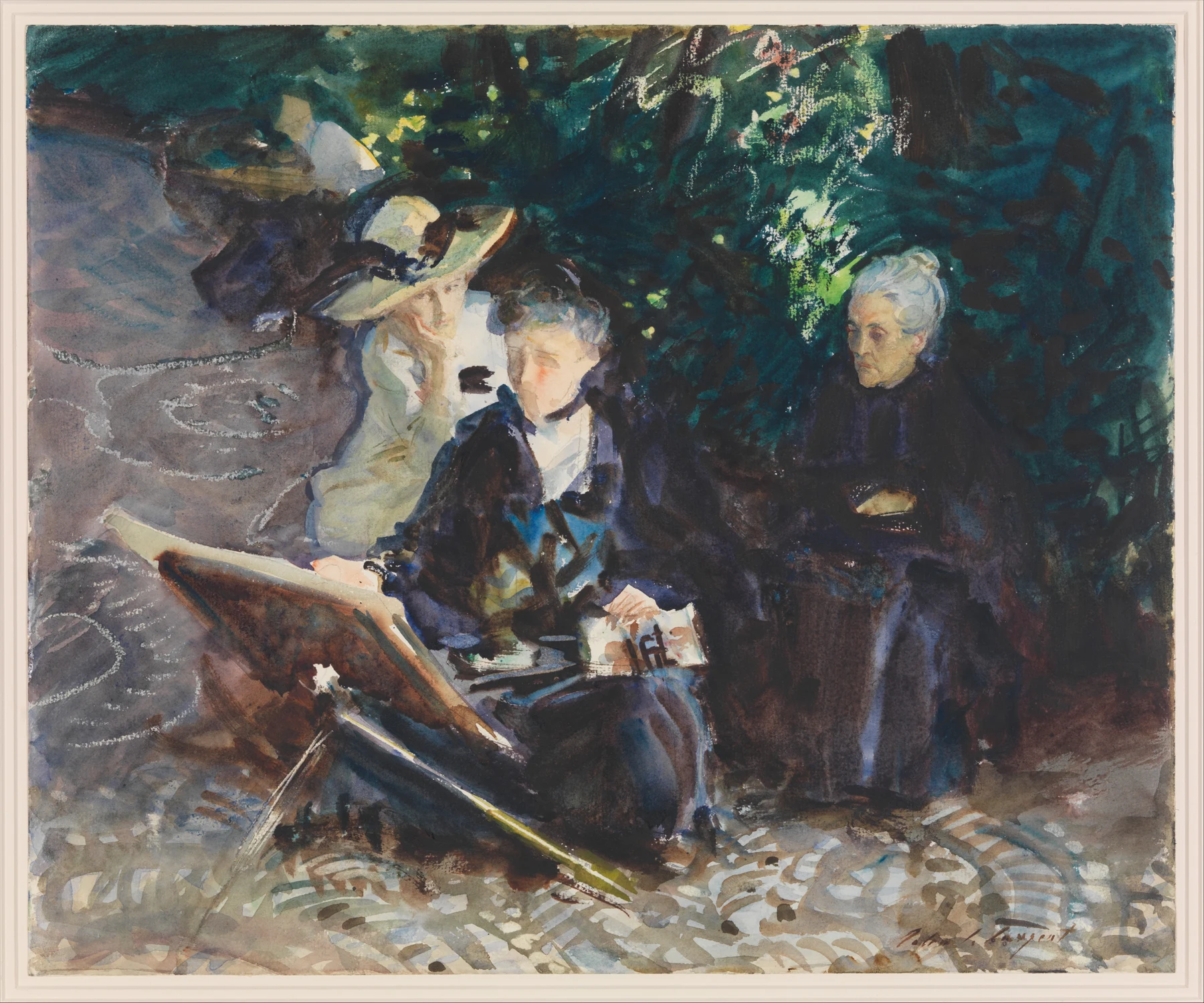
- In the Generalife, the light faces and clothing emerge from a large, connected area of foliage and dark dress. Start with that relationship before counting leaves.
- The easel makes a strong diagonal through the lower half. The pale, broken paving carries the eye across the foreground rather than becoming a separate inventory of stones.
- The museum records wax crayon as well as watercolour and graphite. A light mark in a reproduction is not automatically proof of untouched paper.
These observations describe what is visible, not how the artist made the painting.
The man behind the apparently effortless mark
John Singer Sargent can make a difficult bit of painting look mildly inconsiderate. A face turns, sunlight catches a sleeve, and a complicated building appears to have agreed to be three shapes. It is tempting to read this as speed alone. His life offers a more useful explanation: sustained training, years of looking, and a formidable ability to decide which relationships mattered.
Born in Florence in 1856 to American parents, Sargent grew up travelling in Europe. Drawing belonged to family life before it became professional training. In 1874 he entered Carolus-Duran’s Paris studio and also studied drawing at the École des Beaux-Arts. Carolus-Duran encouraged direct painting and broad tonal relationships, with Velázquez an important model. That is not the same thing as dispensing with drawing; it means using drawing and tone to make a convincing whole.
Sargent exhibited at the Paris Salon from 1877. Journeys to Spain and the Netherlands brought close study of Velázquez and Frans Hals. Later contact with Monet and painting outdoors in England sharpened his interest in changing light. He occupied several artistic worlds: American by nationality, formed in European studios and collections, working across international networks of friends and patrons. Calling him simply an English painter, or simply an Impressionist, shuts too many doors.
For us, the useful distinction is between a quick-looking result and a hurried decision. Before making a fluent stroke, you need to know where it starts, how dark it is and what it joins. The brush is quite happy to move quickly without any of that information. It is the painting that usually objects.
Madame X: looking, ambition and public judgement
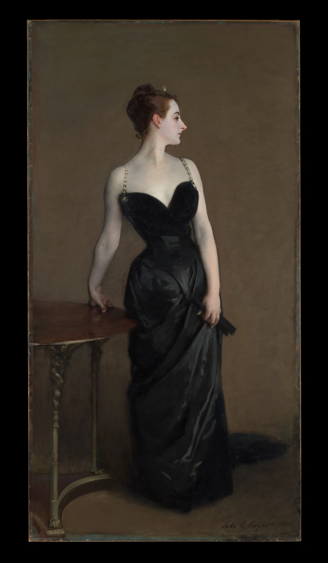
Madame X, painted in 1883–84, shows the Louisiana-born Paris society figure Virginie Amélie Avegno Gautreau. This was not a routine commissioned portrait that went wrong: Sargent pursued the project with Gautreau’s participation, hoping that exhibiting it would enhance his reputation. Its reception at the 1884 Salon was hostile. The daring presentation originally included one dress strap slipping down her shoulder; he subsequently repainted it in its present position.
The scandal is part of its history, but do not let it swallow the painting. The pale head and shoulders, dark dress and restrained background make a powerful arrangement at a distance. Her profile directs attention sideways, while the dress creates a long, nearly continuous shape below. The small variations matter because the large divisions are so clear. This is oil on canvas; our watercolour lesson is a comparison of design, not an instruction to handle the materials identically.
Sargent moved to London in 1886, rather than departing Paris overnight after the Salon. His British reputation grew, and portraits brought substantial international success. Wealth, dress, posture and performance were built into that business. A portrait could celebrate a sitter while also making the effort of social presentation visible. Admiring its brushwork need not mean accepting its privileged world as the whole of society.
Try viewing Madame X as a tiny image. The head still has somewhere to turn and the figure still occupies the room. Now imagine rendering every satin highlight before establishing that silhouette. You could work for hours and end up with an impeccably described frock in search of a person.
Study one: three values, one convincing presence
- Place a dark coat over a chair beside a window, or ask a willing sitter to hold an easy pose. Make three 5 cm pencil thumbnails, grouping everything into paper-light, middle and dark.
- Choose the clearest silhouette. On a small piece of watercolour paper, draw only the outer shape, its main angle and the division between light and shade.
- Use one colour. Keep the main light unpainted, join the middle tones, then let the wash dry before adding one connected dark. Leave buttons and decorative details out of this meeting.
- Put the study across the room. Add a small accent only if it clarifies the pose or the direction of the light.
Look back: Can you read the subject at thumbnail size? If it collapses when the details disappear, revise the large shapes on a fresh thumbnail before repainting.
Watercolour was not a late-life hobby
Sargent used watercolour in childhood and on travels long before his mature reputation in the medium. After 1900 it became an increasingly important arena for his work. In 1907 he resolved to reduce the burden of commissioned oil portraits, although exceptions and charcoal portrait work continued. Murals, landscape and work on paper occupied more of his attention. The change was a shift of emphasis, not a theatrical abandonment of everything he had learned.
The institutional history matters. Brooklyn acquired a major group from his New York watercolour exhibition in 1909; the Museum of Fine Arts, Boston, bought its group in 1912. These were substantial museum acquisitions made during his lifetime. The sheets were being valued as works in their own right, not merely useful notes for more important oils.
Portability opened possibilities: architecture seen at an awkward angle, travelling companions at rest, working animals, foliage and water. The subject could be modest while the pictorial problem remained demanding. His watercolours make it difficult to maintain a neat hierarchy in which a grand portrait is serious and a patch of sunlit paving is a diversion.
That is one reason they matter to painters now. A picture can earn its attention through the exactness of its relationships rather than the prestige of its subject. Your back yard is not disqualified because Venice was unavailable. The question is whether you have found something worth noticing there.
In the Generalife: people belong to the light
The opening painting was made in 1912 in the Generalife gardens at Granada, associated with the Alhambra. The Met identifies Sargent’s sister Emily painting at an easel, with the artist Jane de Glehn at left and their Spanish friend Dolores Carmona at right. These are particular people, not anonymous decorative figures added to improve a garden. The picture brings portraiture and outdoor painting into the same space.
Look at the distribution of light. The central face and collar sit against deep blue-green and brown passages. Around them, the garden is active but unevenly described: some leaves are distinct, others merge. The easel cuts across the lower area, linking the seated painter to the space in front. Faces receive attention without becoming isolated cut-outs.
Notice the pale, scribbling interruptions across the paving. The recorded medium includes wax crayon. We should not assign an exact process to every visible mark from a screen image, but the materials record stops us turning all the lights into a moral lesson about reserving white paper. Sargent’s handling allowed more than one route to a lively surface.
For your own study, ask where the darkest surrounding shape makes a light most convincing. Painting a stronger background can do more for a sunlit sleeve than adding another warm wash to the sleeve itself. Colour is relational: the neighbouring patch has a vote. It will exercise that vote whether you invited it or not.
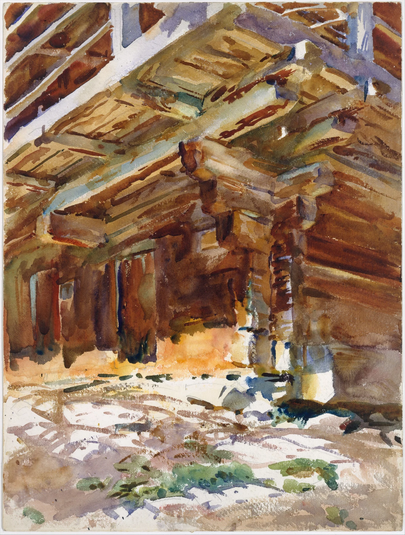
Abriès: the building is a pattern before it is a building
Abriès, around 1912, fills the sheet with timber, overhangs and oblique planes. The viewpoint makes architecture feel close and physical. Dark openings are held within warm structural passages, while cooler touches and broken pale foreground shapes interrupt the warmth. Try following the broad diagonals before identifying individual pieces of construction.
This is the practical value of cropping. Sargent does not need to supply an entire village, a polite horizon and a complete explanation of the weather. A selected piece of the visible world can make a complete pictorial event. What sits outside the frame is allowed to remain outside it.
The effect should not be reduced to a recipe for careless looseness. Brooklyn Museum’s technical account of another watercolour, Santa Maria della Salute, describes ruled graphite architecture, wet washes and scraped highlights, with less drawing devoted to boats and figures. The preparation and handling vary according to the job. Precision in one area can make freedom elsewhere convincing.
Nor is transparent purity a helpful test of whether a Sargent succeeds. Museum records document opaque colour, wax resist and reductive techniques in different works. Learn what a mark achieves before turning its material into a commandment. For the exercise below, keep to ordinary washes and reserved paper so that you can compare a small number of decisions clearly.
Study two: a Liverpool doorway, with fewer explanations
- Choose your own doorway, warehouse corner or sheltered passage. Work safely from observation or a photograph you took. Make a wide crop and a close crop; select the one with the strongest light-and-shadow pattern.
- On Baohong rough 300 gsm, or the paper you have, mark three important angles and reserve two small lights. Use the flat for broad planes if it helps; this is not an audition for your smallest brush.
- Test French Ultramarine PB29 with Permanent Brown PBr25 on scrap for a usable neutral. Make a warm variation and a cooler one by changing the balance. These are suggestions for Mark’s palette, not Sargent’s documented pigments.
- Paint the large planes. Let the paper dry, then connect the main shadow shape across the architecture. Keep one edge crisp and soften another with a clean, damp brush while the paint is still workable.
- Allow yourself five finishing accents. Spend them where they explain an opening, an overlap or the light. Stop before the brickwork hires its own management team.
Look back: Do the diagonals and main shadow still organise the painting from two metres away? Name one detail you omitted that the picture never missed.
Beyond the sunshine: labour, war and a wider career
Sargent’s later work was not exclusively leisure in beautiful places. In 1918, aged 62, he worked as an official British war artist in France and Belgium. His encounter with gas casualties informed the large oil painting Gassed, completed in 1919. The familiar virtuoso of fashionable portraiture was also confronting injured bodies, dependence and the machinery of war.
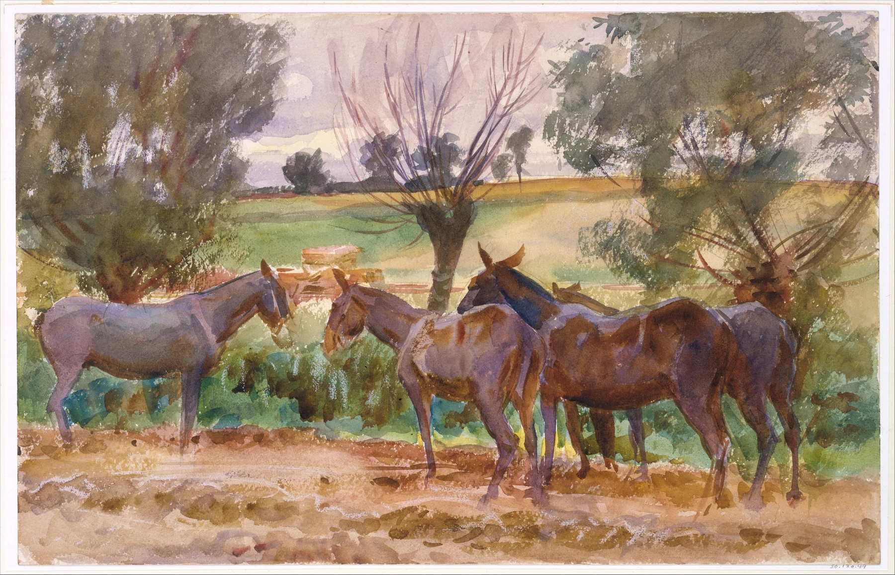
Mules, painted in 1918, belongs to that wartime period. The Met connects these animals with transport near the front. The sheet does not need a battle scene to carry that context. Animals stand in a shallow group, their legs meeting broken ground; an open field and trees extend beyond them. Knowing the circumstances changes what might otherwise look like a peaceful rural pause.
Keep that history alongside the formal looking. The overlapping bodies make a continuous middle-distance band, but individual heads, ears and legs remain legible. Small shifts between warm browns and cooler greys distinguish forms within the group. A painter can observe this organisation without treating wartime labour as a convenient decorative theme.
His mural commissions, including the long project at Boston Public Library, add another dimension to the career. They also remind us that historical art invites criticism as well as admiration: the Library records objections to anti-Jewish imagery in the cycle. A rounded view of an artist allows achievement, patronage and contested representation into the same discussion. Sargent died in London in 1925; the work continues to reward looking without requiring us to turn the man into a flawless mascot.
What to bring back to your own table
The transferable lessons are choices: establish the large value relationship, make a crop with a purpose, vary edges, and let neighbouring colour do some of the descriptive work. None requires impersonating Sargent’s handwriting. Copying a little passage can sharpen your attention; applying what you noticed to your own subject tells you whether you understood it.
Keep a modest distinction between observation and reconstruction. You can see that a dark shape connects two parts of a picture. You may not know the order in which it was painted. Technical research and a modern demonstrator can suggest plausible processes, but a confident explanation is not automatically a historical fact.
For a useful discussion, choose one of the four paintings here and identify the passage you would be most tempted to overwork. What would be lost if it became more explicit? Bring a small study and that question to the studio. It is rather more interesting than asking whether your wash is sufficiently Sargentesque. The wash has enough on its plate.
Watch, look again, then paint.
Two museum films with different jobs: a watercolour reconstruction and a portrait study. These are contemporary artists investigating Sargent, not footage of Sargent at work.
John Singer Sargent Watercolors: Exploring Melon Boats
From Brooklyn Museum · Watercolour reconstruction
Artist Monika deVries Gohlke investigates Sargent’s technique by attempting a reconstruction of Melon Boats. Treat this as a practical investigation of a historical painting, not a surviving record of his exact sequence.
Watch with a question: Which choices need planning before a wash, and which can be adjusted as the image develops? Note the evidence the demonstrator uses rather than collecting a list of supposedly compulsory tricks.
After watching: Choose a small section of your own harbour or still-life subject. Write down the light shape you will protect and the dark shape it needs beside it, then paint a ten-minute study.
Open on YouTube ↗Paint Like a Great: John Singer Sargent
From National Gallery of Art · Oil portrait study — a comparison for watercolour
David Rashid Ibata studies Sargent’s Ellen Peabody Endicott. This is an oil-painting film; its value here is the attention to portrait structure and the purpose of studying another painter.
Watch with a question: How does studying a portrait turn a finished surface into a set of decisions? Separate choices about value and shape from handling that depends on oil paint.
After watching: Return to the three-value coat or sitter study above. Name one decision you can transfer to watercolour and one material-specific action you should not copy directly.
Open on YouTube ↗YouTube supplies the thumbnails. A player loads when you select a film; starting another removes the previous player. Use the direct link if playback is restricted.
Study three: give the light some company
- Put a pale mug or folded cloth beside a dark plant, bag or coat. Use a stable light source. Draw two small identical compositions on watercolour paper, reserving the same highlight in each.
- Paint the first study with a pale background and a middle-value subject. On the second, keep the light subject similar but connect a darker background around part of its edge.
- Use your existing paints. If trying Mark’s palette, test Perylene Green PBk31 with French Ultramarine PB29 for a cool dark, adjusting dilution on scrap. The exercise tests value relationships, not a reconstruction of Sargent’s colour box.
- Let both dry. Compare the apparent brightness of the reserved light, the edges and the strongest point of contrast. Write one sentence explaining which surrounding shape changed the effect most.
- Make one fresh five-minute thumbnail using that discovery. Keep the clearer relationship and leave the unnecessary corrections behind.
Make this a study of your own subject. These are our practice prompts, not a claim to reproduce an artist’s exact method.
Take a practice sheet →- How watercolour claimed a wall of its own
- Cézanne: when the paper joins the argument
- Beyond the souvenir: watercolour, work and witness
Keep looking
- MFA Boston: Elaine Kilmurray’s Sargent biography — training, career and chronology
- The Met: H. Barbara Weinberg, John Singer Sargent (1856–1925)
- The Met: Madame X — the uncommissioned portrait, Salon reception and materials
- MFA Boston: John Singer Sargent Watercolors — the 1909 and 1912 museum acquisitions
- The Met: In the Generalife — people, place, date and wax crayon
- The Met: Abriès — full image and materials record
- Brooklyn Museum: Santa Maria della Salute — technical notes on drawing, washes and scraping
- The Met: Public Art and Personal Loss — Sargent and the First World War
- The Met: Mules — the 1918 watercolour and transport near the front
- Boston Public Library: Sargent’s murals — illustrated guide and historical controversy (PDF)
- National Gallery of Art: Paint Like a Great — film context and official video
- Continue: Sargent’s Abriès, a shorter practical profile
- Continue: Homer, Sargent, work and witness
- Paint with your own box: Mark’s twelve-pigment mixing guide
Sources support the factual context; looking notes and exercises are Watercolourist editorial interpretation.
What happened on your paper?
One useful observation beats “lovely work”. Show a study, ask about a decision, or tell us where you disagree.
Join the studio discussion