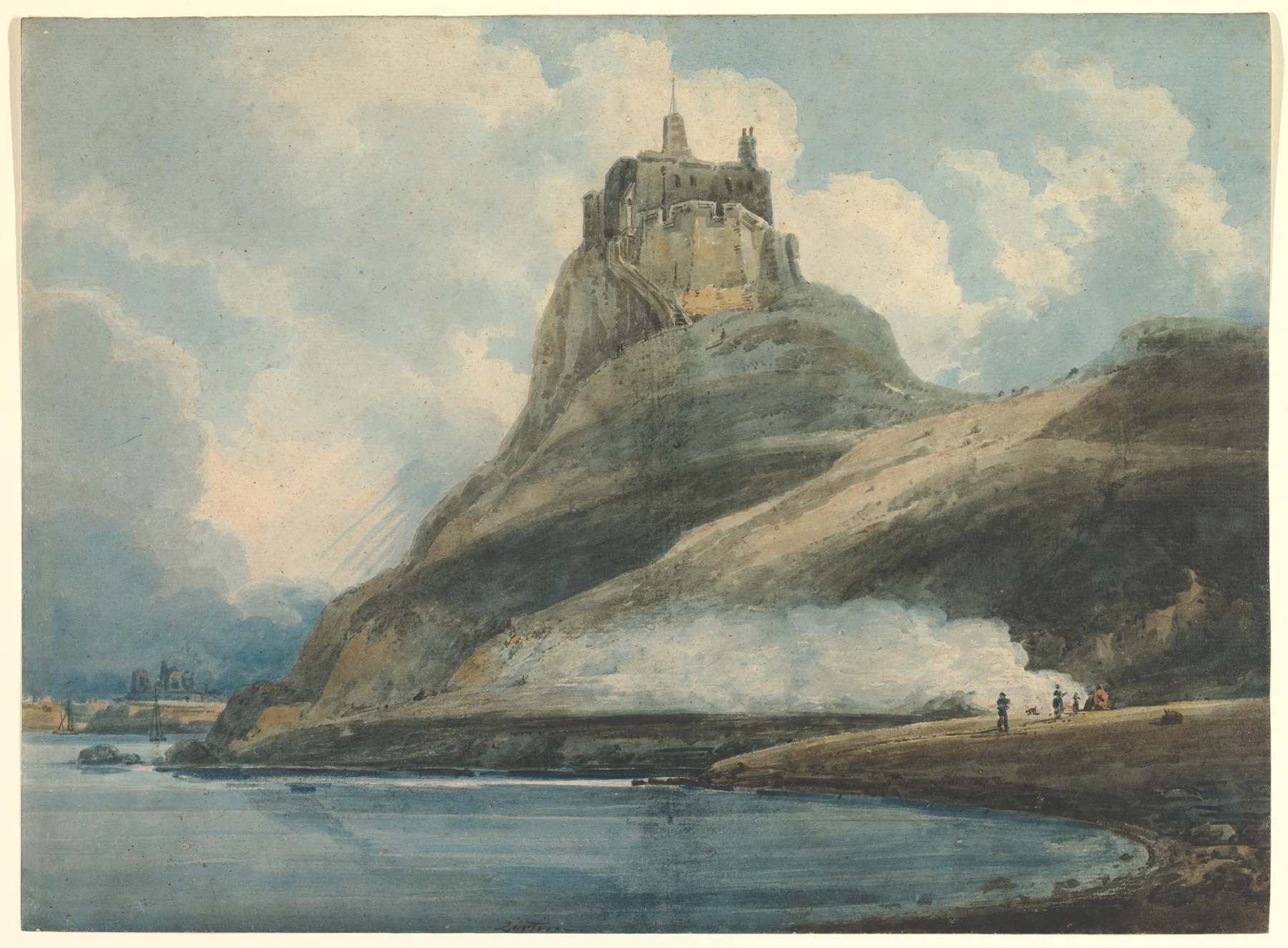
- The cliff in Girtin’s Lindisfarne dominates the tiny shoreline figures; the curve of water opens space beneath it.
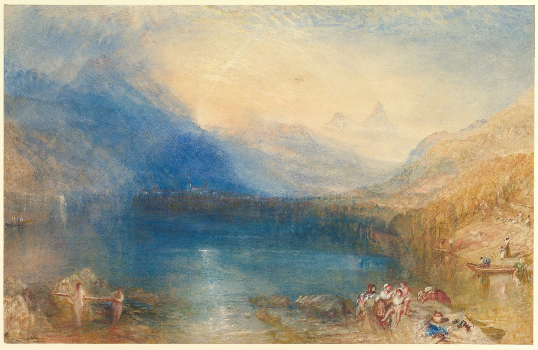
- Turner’s Lake of Zug gathers blue across the centre, with a pale opening above and warm accents near the foreground.
These observations describe what is visible, not how the artist made the painting.
A history of audiences as well as brushes
British watercolour around 1800 was changing its public ambitions. Artists could gather information in a portable sketchbook, then make independent pictures intended for exhibition and sale. The distinction matters: a quick field record and a highly worked exhibition sheet may share materials without sharing a purpose. If we call everything on paper a sketch, we miss the artist’s argument before we have properly looked at it.
Getty’s account of British exhibition watercolours describes larger formats, stronger colour and increasingly dramatic compositions as painters challenged the dominance of oil painting. A dedicated watercolour society formed in 1804. This institutional change helped create an audience for the medium on its own terms. Watercolour did not suddenly acquire artistic intelligence that year; it acquired another place in which that intelligence could be seen. The exhibition wall, collector and catalogue belong in the story beside the brush.
Girtin makes a coastal view carry weight
Thomas Girtin’s Lindisfarne Castle dates to 1796–97. The Met suggests that it followed sketches from his northern journey in 1796 and may have appeared at the Royal Academy the next year. Those qualifications are useful: a likely sequence is not a surviving diary of every brushstroke. What we can see is the enormous cliff and castle rising above a very small group at the shoreline.
The dark slope cuts across a softer cloud-filled sky, while the water opens a pale route around the base. The castle is recognisable, but its scale and setting make the view more than a building inventory. Compare the height of the people with the height of the rock. Now cover the figures. The place remains, but your bodily sense of its size changes. That is an expressive decision a topographical subject can carry without abandoning its identity.
Turner, light and the problem with a purity test
Turner’s The Lake of Zug, made in 1843, offers a later example. Broad blue water sits beneath a luminous opening, with warmer colour gathering at the sides and foreground. The eye moves between clarity and uncertainty: a small near figure is graspable, a distant mountain much less so. Compare this with Girtin’s more decisive dark mass. Neither artist needs to describe every available fact to establish a place.
Both museum records complicate the notion that historical watercolour always obeyed a transparent-wash rule. Girtin’s sheet includes bodycolour; the Turner includes bodycolour and reductive techniques over graphite. The V&A explains that nineteenth-century British collecting helped promote a particular national story of the medium. Its account also shows how that story changed as earlier tinted drawings entered the collection. Museum categories are historical choices, not instructions delivered with the first paintbox.
Why this matters at the studio table
A history of progress from timid drawing to heroic painting is tempting because it is easy to remember. It is less useful for looking. A restrained wash may be exactly right for an intimate album; an elaborate sheet may be designed to command a crowded room. Ask what a work was made to do and for whom before deciding that more colour means more achievement.
Try the same distinction with your own subject. Make one small record to preserve the arrangement of a street, then a second version designed to make someone feel the height, weather or emptiness of it. Keep both. The second does not invalidate the first, and the first may contain information that rescues the second. A sketchbook is allowed to be a workshop rather than a queue of miniature masterpieces.
One place: record and interpretation
- Choose an ordinary building or street from your own observation. Make a small pencil-and-wash record, noting the large proportions and light direction.
- Make two thumbnails that alter the viewpoint or relative size of the foreground. Choose the one that best communicates a feeling you actually observed.
- Paint a second small version from that plan. Use a clear value arrangement and let one area remain less described.
- Put both versions side by side. Write what each communicates and where the second depends on information gathered in the first.
Make this a study of your own subject. These are our practice prompts, not a claim to reproduce an artist’s exact method.
Take a practice sheet →- Cézanne: when the paper joins the argument
- Beyond the souvenir: watercolour, work and witness
- Sargent: a life in paint, a lesson in looking
Keep looking
- V&A: What is watercolour? — the changing history of the category
- Getty: Luminous Paper — exhibition watercolours, travel and audiences
- The Met: Girtin, Lindisfarne Castle — date, context and materials
- The Met: Turner, The Lake of Zug — full work and materials
Sources support the factual context; looking notes and exercises are Watercolourist editorial interpretation.
What happened on your paper?
One useful observation beats “lovely work”. Show a study, ask about a decision, or tell us where you disagree.
Join the studio discussion