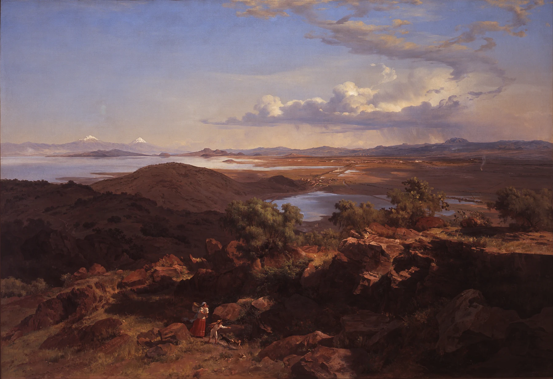
- Velasco's pale basin links distant places beyond the darker foreground rocks.
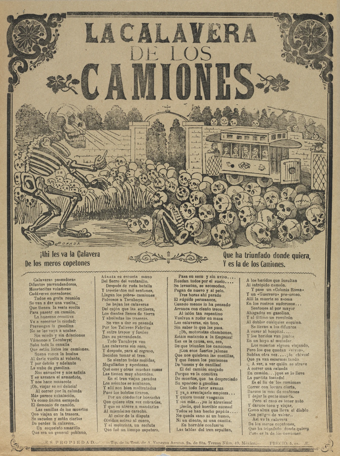
- Posada places the largest skeleton opposite the vehicle, with a crowd of skulls between them.
- The painting distributes attention across depth; the print stacks headline, image and verse down the page.
These observations describe what is visible, not how the artist made the painting.
Start with two different objects
José María Velasco's 1875 Valley of Mexico from the Hill of Santa Isabel is an oil painting. José Guadalupe Posada's Skeleton of the Buses, dated about 1900–10 by Cleveland, combines relief etching and letterpress. Both makers were Mexican; neither object is a watercolour. Bringing them together here opens a wider question for painters: what changes when a picture addresses the expansive idea of a country or the immediate experience of its streets?
This is our comparison, not evidence that the two works were conceived as partners. Their materials, dates and means of circulation differ. A painted panorama can reward sustained inspection; a printed sheet can put a headline, a joke and an image into repeatable form. Neither task is automatically more serious. Art history gets considerably more interesting when the inexpensive sheet is allowed into the conversation.
Velasco: observation becomes a national view
MUNAL places Velasco's work at the meeting of national landscape and scientific naturalism. The National Gallery further identifies his interests in geology, local plants, archaeology and industrialisation. This matters because a landscape is never only a pleasant arrangement of hills. The things an artist studies and chooses to show can make a place intelligible as territory, environment and shared history.
The Minneapolis Institute of Art describes his training with Eugenio Landesio at the Academia de San Carlos, including attention to geographical features, vegetation and architecture. Observation, however, does not remove composition. Its discussion of a different Valley of Mexico painting, dated 1877, explains his rearrangement of elements. Keep that later work separate from the 1875 image shown here; its individual symbols and exhibition history should not be silently transferred across.
In our reproduction, the small foreground people sit within a vast structure of rocks, water, settlements and sky. Our reading is that their modest scale encourages the eye to treat the country itself as the principal subject. The pale basin connects far-separated areas, while the darker nearby ground gives the viewer a place from which to look. The arrangement makes distance feel available to inspection.
Posada: modern transport meets an unforgiving passenger
Cleveland connects Posada's print with the dangers of Mexico City's electric trams. Death beckons passengers towards a graveyard. The museum also explains that inexpensive, reproducible works helped Posada reach a broad public and that later Mexican artists admired this achievement. Text and image share the job of commenting on contemporary life. The humour has a recognisable target; the skeletons are doing more than supplying decorative atmosphere.
Look at how quickly the large figure on the left and the crowded vehicle on the right establish a relationship. Then notice the smaller skulls between them and the columns of verse below. Our eye moves from a blunt visual proposition to increasingly specific information. It is a different pace from Velasco's recession into pale distance. Here the picture comes forward to meet us, with an alarming amount of confidence about the destination.
Public meaning does not require one national style
Together, these works resist the idea that Mexican art should have one recognisable appearance. Scientific attention, academic training, popular printing and social humour belong to different but overlapping cultural worlds. The juxtaposition helps us ask how a public image is constructed, rather than deciding which work is the more authentic expression of a nation. No single painting or print can carry that entire responsibility.
For your own watercolour practice, audience is a practical compositional choice. A view made to help a friend recognise a place may need a route or landmark. A page commenting on a daily frustration may need a gesture and a sentence. Try both with the same location. Let purpose change scale, cropping and emphasis. A technically lovely wash can still be vague about what it wants the reader to notice.
One location, two intended readers
- Choose a place you know and write two aims: help someone understand its layout; comment on one specific thing that happens there.
- Make a broad watercolour thumbnail for the first aim, selecting a clear viewpoint and two useful landmarks.
- Make an ink-and-wash page for the second, using a tighter crop, one readable action and a short original caption.
- Show both without explanation. Ask what each communicates, then change one scale or placement decision in response.
Make this a study of your own subject. These are our practice prompts, not a claim to reproduce an artist’s exact method.
Take a practice sheet →- Who gets to become an artist? Morisot and Gyokuran
- Indian natural-history painting: artists, animals and the patron’s eye
Keep looking
- MUNAL: Territorio Ideal, Velasco and the distinct Valley of Mexico paintings
- National Gallery: Velasco's scientific interests and modernising Mexico
- Minneapolis Institute of Art: Velasco's training and the 1877 composition
- Cleveland Museum of Art: Posada, print circulation and transport satire
Sources support the factual context; looking notes and exercises are Watercolourist editorial interpretation.
What happened on your paper?
One useful observation beats “lovely work”. Show a study, ask about a decision, or tell us where you disagree.
Join the studio discussion