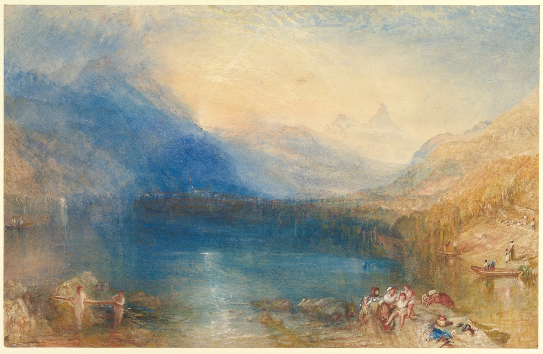
- A blue mountain mass fills much of the left side.
- The central sky and distant water are much paler than the near shore.
- Figures and boats give a human scale to the large atmospheric spaces.
These observations describe what is visible, not how the artist made the painting.
What is this painting?
Turner’s 1843 view opens across Lake Zug towards a luminous gap between mountains. Small figures and boats occupy the foreground; the great pale distance appears to swallow them. The Met identifies the town as Arth and the peaks as Rossberg and Mythen. This was a commissioned watercolour, developed from a preparatory design after a Swiss journey, rather than simply a sketch carried home in a damp pocket.
Why it matters
This sheet unsettles the idea that good watercolour must obey one immaculate transparent-wash recipe. The museum describes dilute and drier paint, opaque mixtures and scraping back to the paper. Watercolour here is a worked surface with several kinds of light, not a purity contest. The foreground and distant mountains also allow two scales of experience to coexist: people going about their business, and a landscape that exceeds them.
Stay with the surface
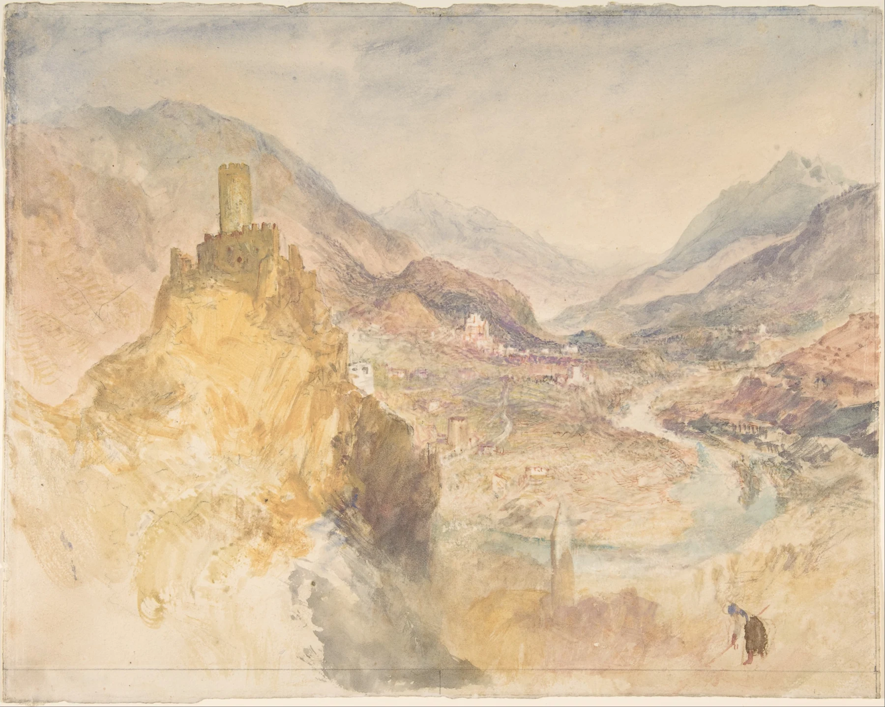
Look at the broad blue mass on the left before counting the people. It gives the pale centre something to push against. The warmer right bank balances that cool weight without becoming its mirror. Then follow the thin bright interruptions across the water: the eye moves between atmosphere and incident. That is our reading of the image, rather than a recovered list of Turner’s intentions. The companion view of Châtel-Argent offers another chance to compare a small human world with a much larger setting.
For discussion: does the painting’s emotional force depend more on the luminous centre or on the heavy blue that contains it? Try covering one area with a piece of paper held in front of the screen. No need to put a Post-it on the Turner.
Let the dark make the light
- Draw three small boxes and reserve a pale centre in each.
- Paint one connected cool dark beside the light; change its size in each version.
- Add a small warm shape on the opposite side. Compare which arrangement feels most expansive.
Make this a study of your own subject. These are our practice prompts, not a claim to reproduce an artist’s exact method.
Take a practice sheet →Keep looking
- The Met: The Lake of Zug, materials and commission context
- The Met: Châtel-Argent, above Villeneuve, Val d’Aosta
Sources support the factual context; looking notes and exercises are Watercolourist editorial interpretation.
What happened on your paper?
One useful observation beats “lovely work”. Show a study, ask about a decision, or tell us where you disagree.
Join the studio discussion