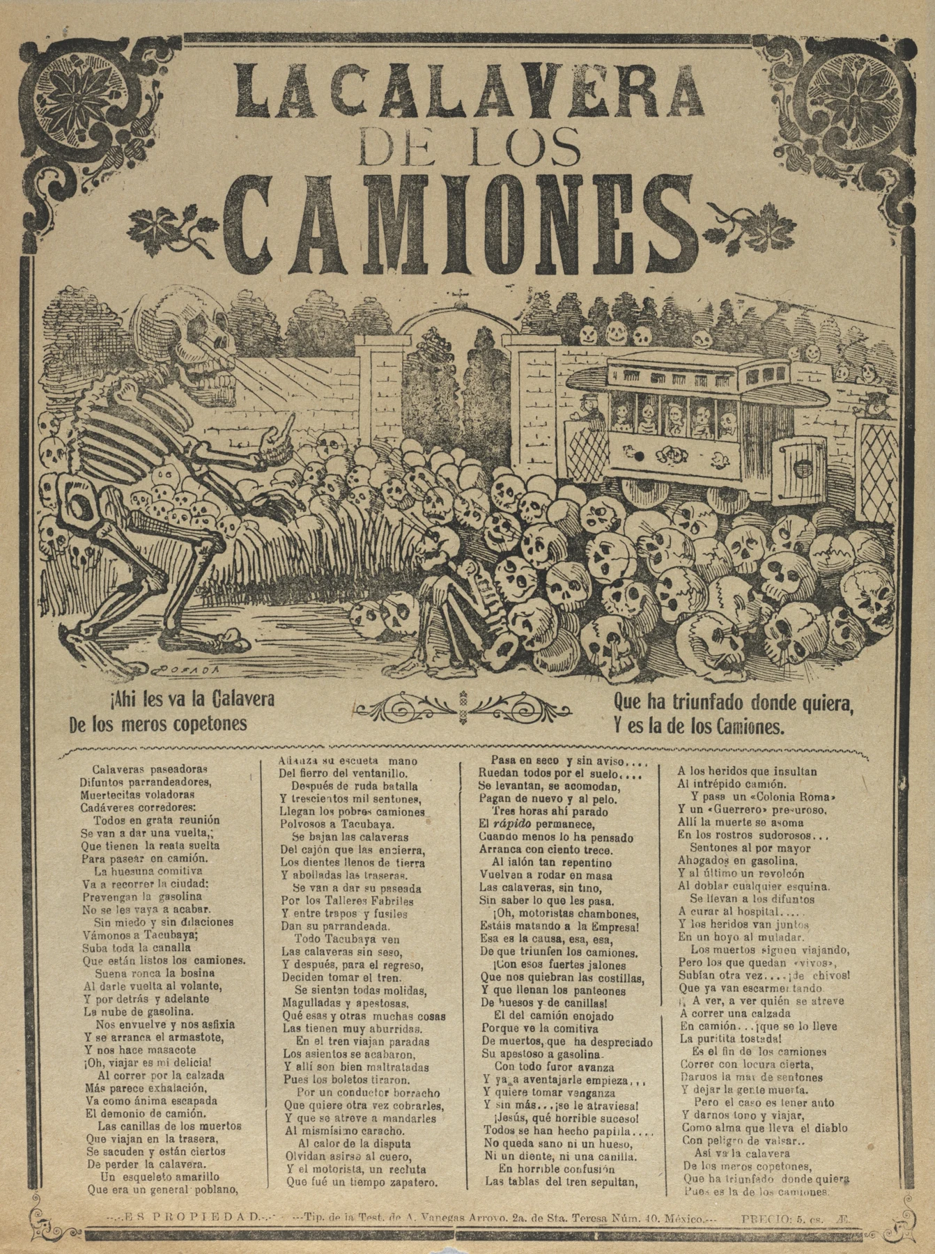
- The very large headline sits above a central picture, with narrower columns of verse beneath.
- A large skeleton at the left gestures towards the vehicle at the right; repeated skulls fill the space between.
- Fine parallel marks create grey-looking areas alongside solid black letters and eye sockets.
These observations describe what is visible, not how the artist made the painting.
A public picture with a job to do
José Guadalupe Posada’s print combines an imposing headline, a central illustration and columns of verse. The Cleveland Museum of Art dates this impression to about 1900–10 and identifies the processes as relief etching and letterpress. Its collection title is The Skeleton of the Buses. The museum interprets the scene as a warning about dangerous public transport in Mexico City, with Death receiving passengers at a graveyard.
This is part of Posada’s broader use of skeleton imagery to address contemporary life. Cleveland emphasises that inexpensive production helped his prints reach a large public and that later Mexican artists admired that directness. The work deserves attention as a specific piece of Mexican popular print culture. It has a subject, an audience and a biting joke, as well as an excellent supply of bones.
Three scales of information
Stand back from the image and the headline arrives first. Move closer and the large skeleton at the left faces the crowded vehicle on the right; the mass of skulls joins them across the centre. Closer still, small marks distinguish teeth, ribs, faces and clothing. The verse below introduces another kind of attention. A viewer can enter at several levels without requiring every mark to be equally prominent.
Notice the difference between the large open eye sockets and the fine repeated lines describing shadows. The print creates variety within a restricted black-and-paper vocabulary. That is useful for an ink-and-wash painter: line density can change a value without adding a new colour. It also gives us a good excuse to postpone buying yet another grey.
Bring the clarity into your sketchbook
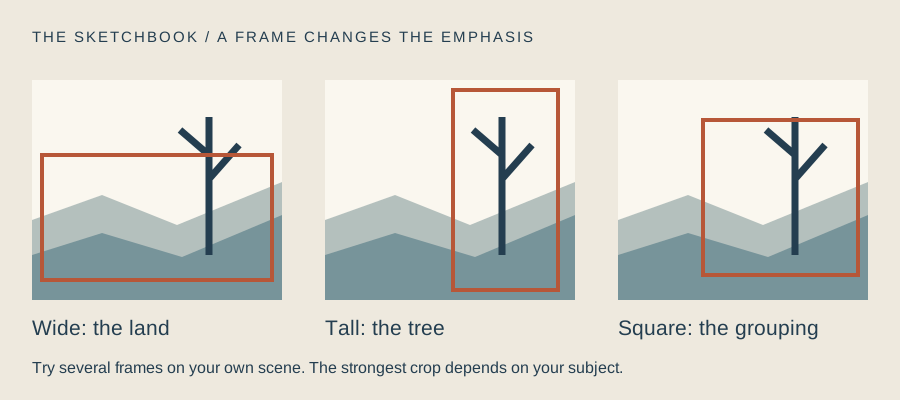
Our studio comparison concerns arrangement, not a claim that Posada worked in watercolour. Design a page around one everyday inconvenience of your own: a late train, a leaking umbrella or a queue that appears to reproduce by division. Keep the drawing and caption specific enough to communicate your observation.
Make the main action readable as a silhouette before adding small marks. Then choose where a light wash would help separate one group from another. Leave a second version in ink alone and compare them. Colour should earn its space on the page; sometimes a strong printed image teaches us precisely how little we need.
One everyday complaint, clearly drawn
- Write a short original caption about an everyday inconvenience you have observed.
- Plan one large action, one smaller supporting detail and a clear space for the caption.
- Draw in ink with two levels of line density; test whether the action reads at arm’s length.
- Add a single pale watercolour to a second version and decide whether it improves the hierarchy.
Make this a study of your own subject. These are our practice prompts, not a claim to reproduce an artist’s exact method.
Take a practice sheet →Keep looking
- Cleveland Museum of Art: The Skeleton of the Buses — date, technique and interpretation
- Cleveland Museum of Art: collection record and open-access image
Sources support the factual context; looking notes and exercises are Watercolourist editorial interpretation.
What happened on your paper?
One useful observation beats “lovely work”. Show a study, ask about a decision, or tell us where you disagree.
Join the studio discussion