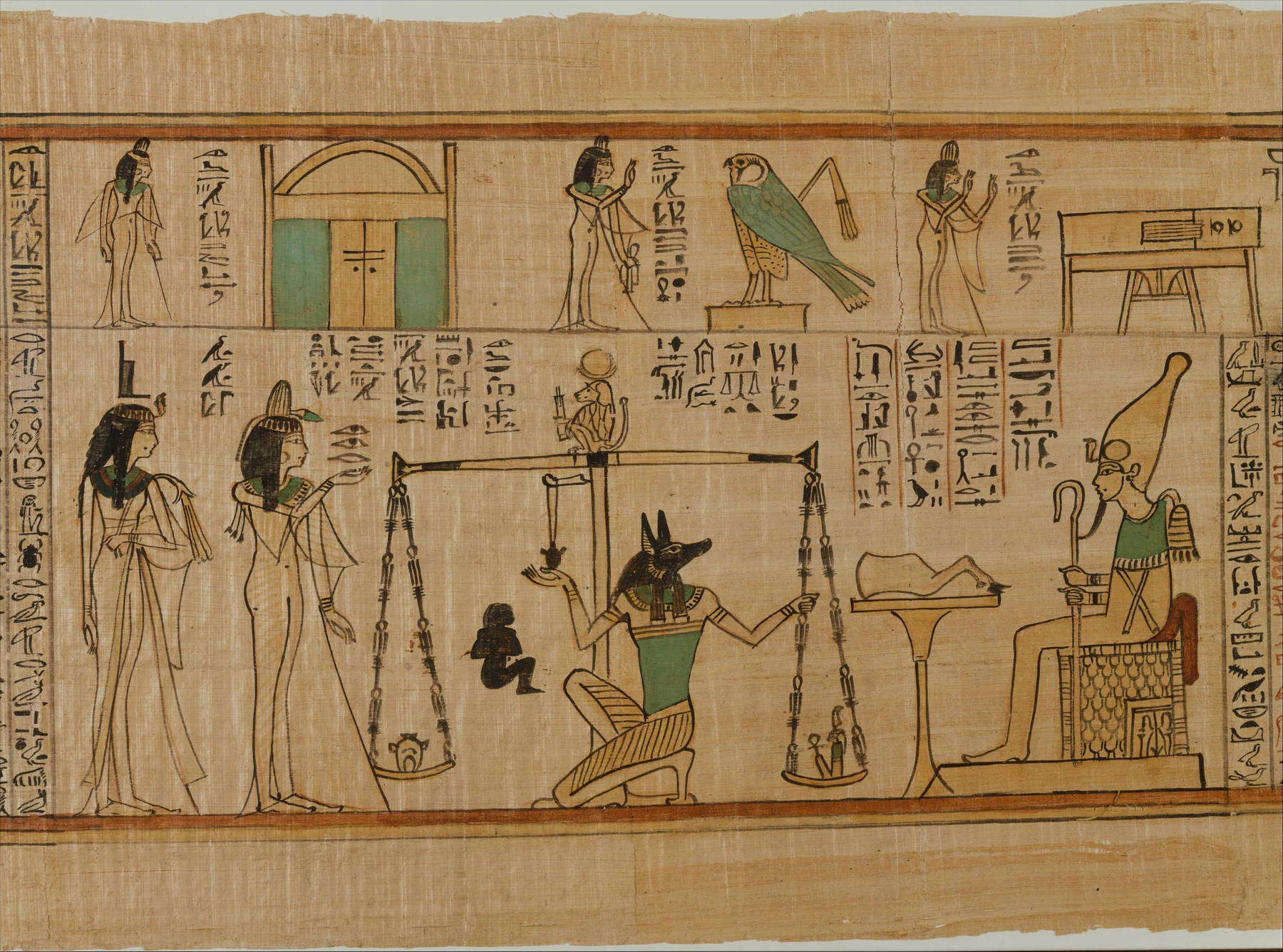
- Follow the green accents across the main detail and compare them with the black contours.
- Look at how horizontal rules and vertical text columns organise different kinds of information.
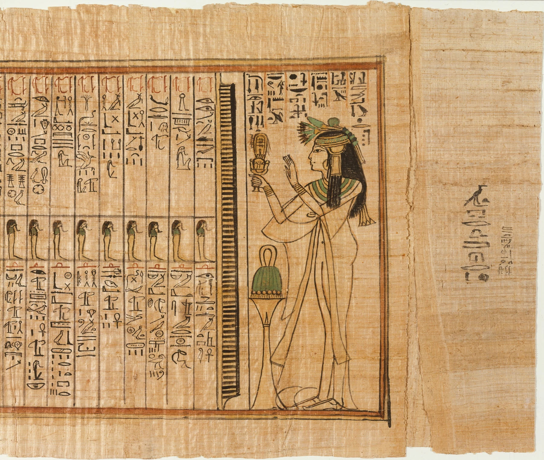
- Compare both museum details, remembering that neither shows the complete scroll.
These observations describe what is visible, not how the artist made the painting.
A work made for Nauny
Nauny was a chantress of Amun-Re. This painted papyrus, dated around 1050 BCE, formed part of her burial equipment at Thebes. She is its owner and subject, not an identified artist. The Met records a scroll more than five metres long; the images here are museum photographs of details. The principal detail shows her heart being weighed against Maat before Osiris. This is paint on papyrus. It belongs here as a related history of painting and illustration, without relabelling an ancient material as modern watercolour.
Why it matters beyond its age
The work joins religious text and image in an object intended to support its owner’s passage into the afterlife. Looking only for a pleasing arrangement would miss that purpose. At the same time, its organisation opens a practical question for an illustrated journal: how can words and pictures share a page without either becoming an afterthought? The answer need not be a caption tucked under a finished drawing. Written areas can be planned at the same time as the images and given their own space.
Notice where colour gathers
Black contours remain legible against the warm papyrus. Green occurs in selected garments and objects rather than filling every available shape. Horizontal rules separate scenes, while columns of writing establish another rhythm. In my visual reading, the limited colour makes the repeated green areas particularly easy to track. Compare the main detail with the second image: the balance between dense writing and a larger figure changes. Seeing both helps prevent one cropped scene standing in for the entire long scroll.
Make a page from your own day
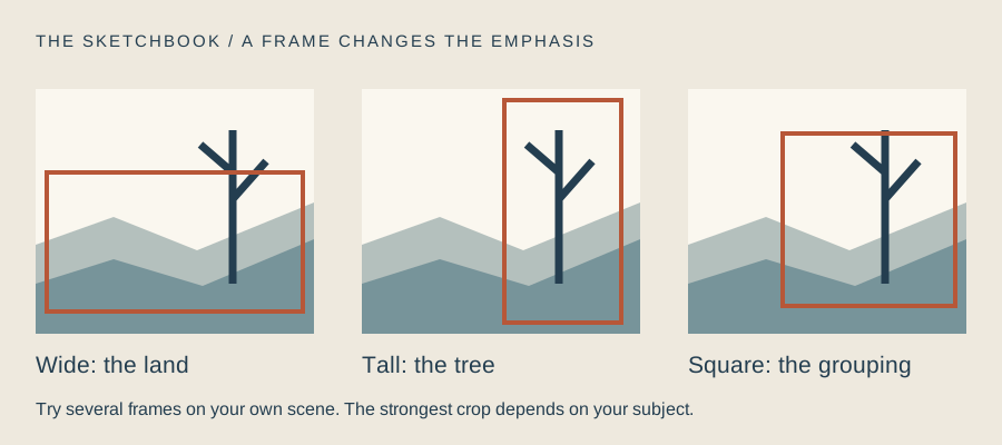
Divide a sketchbook spread into two bands and record three ordinary moments from a walk. Use your own handwriting alongside simple drawings, reserving one accent colour for a recurring subject. This is a modern exercise in page design, not an imitation of Egyptian funerary practice or an attempt to invent hieroglyphs. Plan the spaces before drawing the details. Leave enough room for the words you actually want to write. A page can be lively without every square centimetre joining the conversation.
Three moments, one accent colour
- Divide a page into two bands and reserve three spaces for brief notes in your own handwriting.
- Draw three observations from a walk using waterproof ink or a dark watercolour.
- Repeat one accent colour in selected areas, leaving other forms as line alone.
Make this a study of your own subject. These are our practice prompts, not a claim to reproduce an artist’s exact method.
Take a practice sheet →Keep looking
Sources support the factual context; looking notes and exercises are Watercolourist editorial interpretation.
What happened on your paper?
One useful observation beats “lovely work”. Show a study, ask about a decision, or tell us where you disagree.
Join the studio discussion