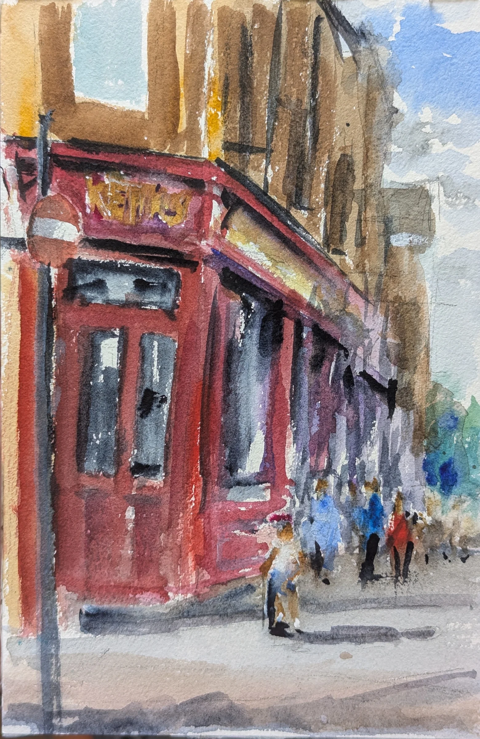
Buy information before equipment
If every wash dries before you can work it, another blue may not solve the problem. Start with a small comparison of surfaces. Keep your existing paints and brush, and try sample-sized pieces of two watercolour papers. Label them before painting. The object is to discover what helps your method, not to assemble the most expensive still life of art materials.
Hahnemühle's paper guide distinguishes cotton and cellulose, describing cotton as suited to substantial water and repeated layers, while cellulose offers a practical, often more affordable option. That does not make every cotton sheet identical or every cellulose sheet unsuitable. Fibre is one part of the paper's behaviour alongside its surface, weight and sizing.
Sizing deserves a place in the conversation
Sizing affects how the sheet takes up water. St Cuthberts Mill describes its Millford paper as deliberately hard-sized, keeping water at the surface longer. That is a specific paper formulation, not a rule for all cotton paper. Two sheets with the same weight and fibre description can still feel quite different under the brush.
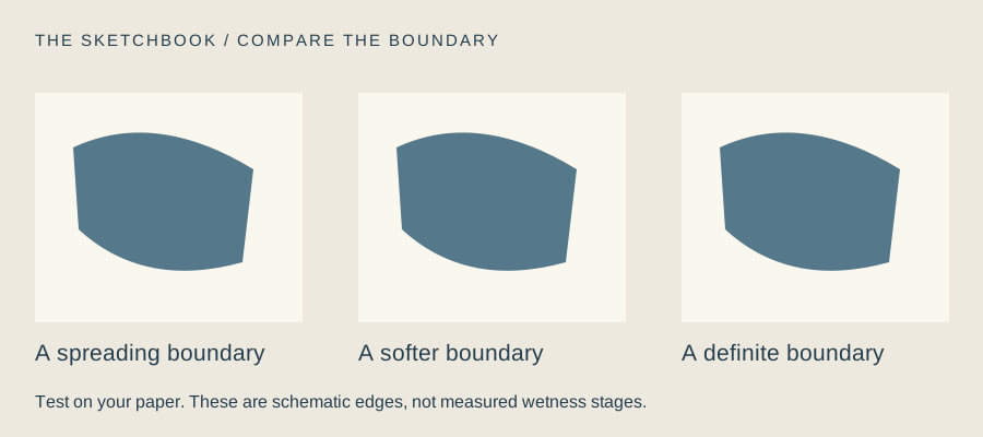
Test a broad wash, a stroke dropped into a damp area, and a second wash over a thoroughly dry first layer. Add a small lifting test. Record how long the surface seems workable, how the second layer behaves, and whether the surface tolerates your correction. Use the same mixtures on each sample. You are comparing your experience rather than scoring a laboratory standard.
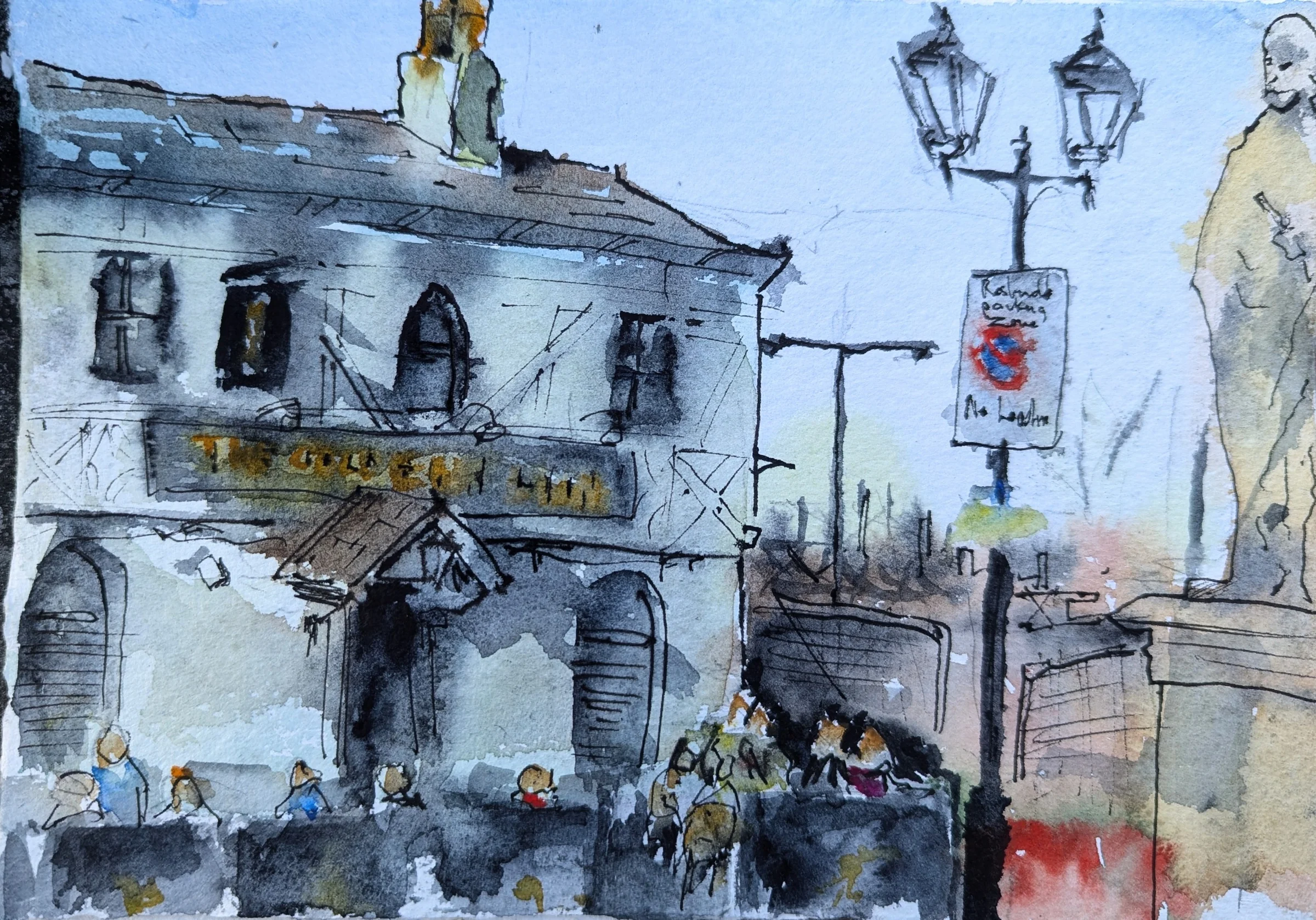
Read the tube as well as the colour name
Winsor & Newton's composition table lists pigment codes alongside opacity, lightfastness and staining or granulation information. Look for the equivalent details from the maker of your own paints. Colour names alone do not tell the whole story. A familiar name may describe a mixture, so record the actual codes when comparing paints.
Choose a few colours you can distinguish and mix confidently before expanding. Single-pigment paints can make a mixing investigation easier to follow, but mixtures are useful too; convenience is not a moral failing. Swatch the paint on the paper you intend to use, with both a stronger application and a diluted wash.
Keep the better-matched paper for the techniques that need it and use the other for whatever it does well: thumbnails, direct studies or colour tests. If money is tight, work smaller. A quarter of a sheet still teaches you about a wash. The sensible purchase is the one that removes a problem you have actually observed. The fantasy of becoming organised through one more palette is, sadly, sold separately.
The two-paper trial
- Label two small samples with paper type, weight and surface.
- Use the same paint mixtures for washes, damp marks and glazing.
- Test lifting on a small patch after drying; allow extra drying time.
- Choose a surface for a specific technique and record why.
Make this a study of your own subject. These are our practice prompts, not a claim to reproduce an artist’s exact method.
Take a practice sheet →Keep looking
- Hahnemühle: watercolour paper guide
- St Cuthberts Mill: Millford and hard sizing
- Winsor & Newton: Professional Watercolour composition table
Sources support the factual context; looking notes and exercises are Watercolourist editorial interpretation.
What happened on your paper?
One useful observation beats “lovely work”. Show a study, ask about a decision, or tell us where you disagree.
Join the studio discussion